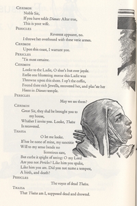
The Play of Pericles, Prince of Tyre: Barbarian Press (2010)
PART I: PERICLES—AN INTRODUCTION
A book that aspires to more.
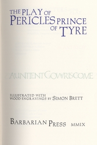
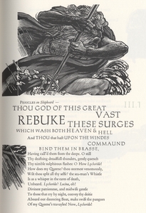
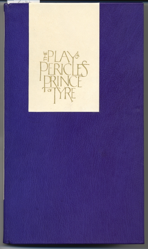
The University of Victoria's Special Collections is home to a large number of unique manuscripts and rare books. Among these texts, the Barbarian Press edition of The Play of Pericles, Prince of Tyre (figure 1) stands out as a bit of an oddity. Where many of these books are considered special because of their antiquity or famous previous owners, Pericles is a fairly recent publication (printed in 2010) and has only ever been owned by the University. Rather, what makes this particular edition notable is its unique page design which, by way of some skilled graphic and typographic innovations, is unlike anything most readers will have ever encountered before.
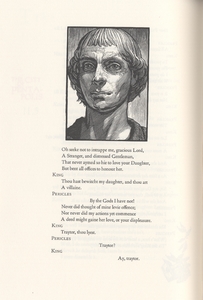
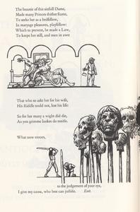
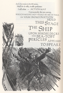
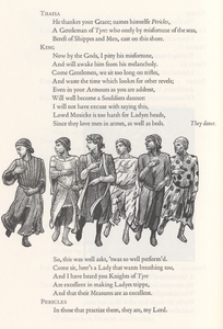
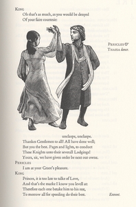
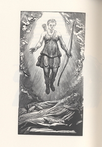
Flip through this edition and one will encounter a series of curiosities. For one thing, the text is not always organized into the tidy rows readers will anticipate in most typeset books but, instead, varies in size, thickness, spacing and sometimes coloring. For another, unlike most play-texts, this edition of Pericles is heavily illustrated and features a series of graphic styles, including portraits, silhouettes, and even comic strip style vignettes. Through these and other design choices, the reader is introduced to a truly novel reading experience – one that, at its heart, seeks to communicate the play-text as its own performance.
While still a recent text, this edition has not evaded critical attention, having won both the first prize for the “Limited Editions” in the 2011 Alcuin Society Awards for Excellence in Book Design and the “Judges Award” for the 2011 Oxford Fine Press Book Fair. This particular publication comes with its own companion volume (figure 2) titled Reading Pericles, which features two essays by Crispin Elsted (the book’s designer and compositor) and Simon Brett (the engraver), describing their creative process and the rationale behind many of their more experimental design choices. Both books are bound in goat leather and vellum and further swaddled very tenderly in a linen-covered chemise and a slipcase.
This online exhibit seeks to recognize the talents of Simon Brett and Crispin and Jan Elsted, the three people responsible for this edition, and also tentatively suggests why this particular edition of Pericles is considered special by many. It functions as an introduction to a book that aspires to be more than a book. In the words of Brett, this edition of Pericles seeks to “bring to life the silences, illustrate the dumbshows, [and] articulate the voyages” of the play, in effect, to “stage” the play on the page (Barbarianpress.com).
PART II: INTERVIEWING BARBARIANS
A local publishing house’s take on fine-press, typography and page design.
I was first introduced to Barbarian Press in the summer of 2017, when my sister invited me to the screening of a student film at the University of Victoria. Perhaps ironically, the film was being shown in the lounge of the brand new Digital Scholarship Commons. I say “ironically” because the film featured a small, old fashioned, hand-press publishing house located in the wilderness just outside of Mission, B.C.—a collection of novelties which immediately sparked my interest.
After the film, which showcased the technical aspects of their operation and some of their finest press works, including Pericles, the Elsted’s elaborated on the topic of fine-press printing, describing some of their own pet paradigms concerning print-culture. Books, for these two, were not just collections of pages bearing beautiful ideas, but could be treasures themselves. Made right, a book’s material aspects could reflect and enhance the beauty of the ideas it contained. At their very best, books could be works of art, elevating the text and the reader into a comfortable, almost sacred experience where edification was a natural by-product.
I performed the following interview on 10 November 2017 in the Elsteds' cottage, overlooking the Barbarian Press house. During the interview, we discussed the process of book design and, specifically, the origins of the Barbarian Press edition of Pericles, as well as some of its more intriguing design features. The Elsteds have approved the following section and also given Special Collections permission to publish this material.
THE INTERVIEW
Me: What first prompted your interest in typography and page-design?
Crispin: I remember enjoying certain books as a kid, Treasure Island or other eighteenth-century books. I just liked the look of them, but I couldn’t really say why, other than they felt comfortable. And that’s as good as any description you’ll get of a well-designed book.
The first time I can ever remember being struck by a book typographically was a book I found in Vancouver. I found it at Falstaff Books and it was the last book from the Kelmscott Press, which was a check-list on the founding of the press. That facsimile just completely knocked me sideways. I had never seen a Kelmscott [book] before, never heard of William Morris, but I looked at it—poured over it—and thought it was wonderful.
Me: It says on your website you moved into your press house in 1978, that’s almost forty years ago. How has your style changed since then?
Crispin: Well, we started out by printing the most outrageous things. Birthday cards with eight different colors, that sort of thing. Of course, we were just picking it up as we went. I’ve had no traditional training in the typographic arts, I’ve learned everything—as Jan has—on the job. One of the things I’ve constantly gone back to is my sense, as a reader, of what a page should look like. I first consider, what is most comfortable for me to read? and next how can I make the most of the text on the page? And that includes everything from the margin of the page, to the paper itself. I tried to replicate what I as the reader, liked to read and the rest just sort of fell into place.
Jan: Well, that’s a product of all the reading you’ve done throughout your life.
Crispin: Yes, I think that’s certainly part of it. I’ve always gone for the classics, because they're well-drawn and they work. So, in that sense, nothing has really changed. But, to answer your question, I remember a fellow printer noticing that—somewhere along the way—we learned to use space on the page. It struck me as odd, because I had never noticed a transition. I just began to do it. I seem to have an eye for balance. I think that was one particular milestone.
Me: How do you navigate legibility and artistry when designing a book?
Crispin: Artistry is very often a canard that people blindly follow. But what you need to look at is clarity, readability, and, what Robert [Bringhurst] calls, “statuesque transparency”—that doesn’t get in the way of the text.
Jan: There is, however, a fine line between that statuesque transparency and the attempt to use the typography to enhance the text. That something—a little bit extra which draws the reader in.
Crispin: But still the beauty has to follow from clarity.
Me: This is probably a good segue into discussing Pericles, which has been described as “experimental” by some. Simon Brett [responsible for the wood-engravings in Pericles] didn’t like this description, do you?
Crispin: He’s right, it’s not experimental. Not in the same sense. The techniques we used in Pericles are traditional in origin—all tried and true. Sure, Pericles might look different from your standard text, but that is because our goals were different. We needed to somehow convey the sense of sound and motion that would be obvious on a stage.
Jan: For example, when you teach Shakespeare, you teach it on its feet. I did that in my teaching career and it made all the difference. The kids just respond to it so well. It’s because Shakespeare is meant to be performed.
Me: And this edition certainly does that—through a number of techniques. Pericles is very unbookish in some ways. Is there a reason you didn’t include page numbers?
Crispin: We didn’t want anything distracting to the eye.
Jan: That’s the practical reason. It’s also because printing page numbers is a pain in the ass [laughter].
Me: How so?
Jan: Oh, well, they’re just down at the bottom and make for an annoying set up.
Me: On that note, I noticed the beginning of the book sports no publication information. But, instead, features the Gower’s [the narrator’s] opening lines.
Crispin: Yea, again, it’s that desire not to distract from the play. The idea was, we wanted to have the reader experience the beginning much like the introduction to a movie. You know, you have your credits rolling in, but meanwhile there’s stuff going on in the background, the movie has already started and you can hear the plot moving forward.
Me: That’s exactly how I felt reading it. You can hear the Gower’s voice, almost as an echo growing in force until the start of the play.
Crispin: Yea, that’s why we had some repetition happening there.
Me: This moves me into my next question. I thought those opening few lines might be calligraphy, but it’s hard to tell. Were those opening lines written by hand?
Cripsin: You’re totally right in that. We had a local calligrapher—Andrea Taylor—do that work. A very talented calligrapher. We wanted something that felt more human and rustic for the Gower’s lines at the opening.
Me: I noticed that the kerning [spacing of the letters] was very tight on those opening lines.
Crispin: Yes, the letters are all sort of a jumble. You have some piggy-backing off of others. We talked about that with Andrea, thought it would add to the effect we were going for.
Me: On the topic of collaboration, what was it like working with your wood-engraver, Simon Brett?
Jan: The thing about Simon is that he is more than just a talented artist and engraver, he is that, but he’s also such a good reader. He’s renowned, likely the best wood engraver in England and been doing it now for more than fifty years. We had worked with him before on our Shelley collection and he did just a lovely job of that.
Me: How did you first get him interested in the project?
Crispin: We approached Simon in 2000, when we all attended the Oak Knoll BookFest together in Delaware. On one of the evenings we went for a walk along the river in New Castle. By the end of the conversation, he was convinced. It took us close to ten years to finally complete the project but, of course, we were doing other jobs along the way and so was Simon.
Me: Was this relationship unique in anyway or do you regularly work with engravers?
Jan: It was unique, in that, we had never before worked so closely with the illustrator. We could read the line and just go with the style we wanted, and see it kind of evolve between the three of us. It is a conversation and a collaboration. What Simon did early in the process was draw up a layout for how he thought each page might look.
Crispin: We were a part of that process too.
Jan: Well yes, we were. He offered us a mock-up of the suggested beginnings for texts and actual drawings he was considering. Of course, he lives in England and had to mail them over. Then we played with the design for a little bit. It was quite the adventure. Just a phenomenal experience. Sort of like a dance, between the three of us. Each partner taking turns in developing something that was really worth-while.
Me: Do you have any examples or memorable stories about your collaboration with Brett?
Jan: There are a few. That moment you mentioned about before, where Marina and Pericles recognize each other, you’ve never seen it on stage have you?
Me: No, I haven’t.
Jan: Oh God, it’s amazing—heart breaking.
Me: I could imagine.
Jan: So that’s the big scene right, and Simon had to come up with a drawing for that. But he knew, we knew, he had to get it right. So finally, he sent us the drawing and it was ninety percent there but, and this is indicative of our relationship, I replied, “Do you think you could make Pericles’ expression more tender?” and he said, “Your instruction is you want more ‘tenderness?’ [laughter] We just had that kind of relationship. So then, when he sent us the wood cuts, he told us to, “Print them ‘tenderly.’”
Me: You are both quite renowned in the fine-press community. Geist magazine’s Michael Hayward names you “the most senior and respected members.” Speaking as two of the elite members of a pretty niche movement, what makes fine-press work important in our contemporary setting?
Jan: I think it’s especially important today, when the human element is disappearing from so many interactions. I mean, we perpetuate a craft which is founded on the connection between the hand and the eye and you are then passing that on to someone else. You’re sharing an experience which can’t be reproduced otherwise.
Crispin: There’s also the aspect of pacing. If you’re working at such high speeds, as everyone seems to be these days, you miss the finer design elements. You need to spend time with a piece to know how it should appear on a page. You can’t find that kind of quality if you rush.
Jan: I don’t know if you remember, there was a CBC interview with a woman artist who was live-streaming wilderness images not too long ago?
Me: No, I’m not familiar. But please, elaborate.
Jan: She was talking about trying to get a sense of geological time and she was quite popular. People would tune in to her channel for even just seconds or minutes to watch and notice that a shadow fell over the boulder or a squirrel ran across or a brief change in lighting. She wanted to draw attention, using that high-speed medium, to the contrast between modern sense of time and geological time. She wanted to get at real-time, somewhere between the two, where humans actually breathe, watch, think and feel, walk and learn. That’s what we’re trying to get at here.
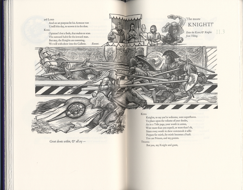
The joust scene from act two in Pericles Act I, scene ii. Pericles is in the foreground of the second page, wearing the serrated helmet (figure 17).
PART III: "PERFORMING" PERICLES
I. A study in dynamic page design
Crispin Elsted summarizes the design demands of this particular edition in his essay, “Reading Pericles,” when he writes, “If an edition of any play for reading (rather than for performance) is to be anything more than a ‘score,’ it must at least attempt to suggest performance – to imply movement [and] vocal nuance” (15). Indeed, Elsted here identifies the disadvantage in reading a script cold, namely, that lines are designed to be performed by actors. While the novelist has the luxury of foregrounding dialogue with descriptive adjectives or verbs, the actor is the sole liaison between the audience and their character, translating the script into sound, motion and presence. As such, Elsted and Brett had their work cut out for them: find a way to imply not only sound and motion, but particular sounds and specific movements through a static medium: page design.
Take, for instance, the tourney scene from act two (figure 17). In the play, Pericles has just washed up on the shores of Pentapolis, having survived a shipwreck. He gathers his rusted armor, which has conveniently washed up on the beach alongside him, and enters a tourney to prove his nobility and possibly even win the hand of the fair princess, Thaïsa. The tourney scene is among the most action- filled in the entire production – featuring bantering courtiers, jousting knights and screaming crowds – and thus features Brett and Elsted’s performative page design at its finest.
The reader’s eye is first drawn to the image of the joust, taking up most of the two-page spread. It is understandable that this image should attract his attention; as page designer and theorist Jan White confirms in his book Great Pages, “Readers interpret size as a measure of importance. The bigger something is on a page the more important it is” (8). As such, the horizontal lines of the lances – both thicker and darker than the surrounding etchings – draw the reader’s attention most notably. Furthermore, the bend of the pages and their recession into the gutter of the volume lends greater visual energy to these illustrations, almost as if the lances exist in three dimensions. The eyes are next drawn to the excited spectators, their animated hands and faces communicating some of the tourney’s energy. Much of the scene’s sound and motion is thus translated through the graphics alone; however, as graphic design expert Scott McCloud reminds us in his book Understanding Comics, graphics by themselves struggle to communicate fully the particularity or specificity of an event (202).
While the Barbarian edition of Pericles is certainly no comic book, Elsted and Brett use techniques native to the comic book genre to imply action and the sequence of events in certain scenes. As such, McCloud’s work on comic books is especially helpful when navigating some of this edition’s more innovative page designs. McCloud divides reality into the Platonic binary of the visible and the invisible. The visible world is a playground for the visual artist; as McCloud writes, “The whole world of visual iconography is at the disposal of the comic creator” (202). However, this world is still subject to ambiguity. Without the text the scene’s specificity and even its sequence is lost to us. This is because a large part of our everyday experience is carried out in the invisible world of “symbols and language” (McCloud 202). The fabric of our everyday life is an interweaving of these two worlds working in harmony to communicate meaning and, in essence, our reality. In light of this, Brett and Elsted’s page design, which relies on both text and graphics, draws closer to translating a real-life performance experience. Furthermore, by combining graphics and text, Brett and Elsted imply the sequence of these events. “Sequential art,” writes McCloud, “offers range and versatility with all the potential imagery of film and painting plus the intimacy of the written word” (212). Notice in this particular scene how Brett’s graphics break up the dialogue into segments. This structure invariably guides the reader into a sequential reading of this passage: as each time they finish a new text block, their eye is again guided to another portion of Brett’s engraving. As McCloud writes, in this way “comics have harnessed the power of cartoons to command viewer involvement and identification . . . to capture the beauty and complexity of the visible” or performance world (203-4).
Indeed, Brett and Elsted’s two artistic mediums work in such intimate harmony it is futile to discuss them separately. As White comments, “It is impossible to show either good or bad examples of text/design partnerships” abstracted from each other and “without long-winded explanations” (36). For this reason, let us walk through a hypothetical first encounter with this two page spread and thereby bring to light how typography and graphic art, working together, might suggest sequence and sound to our reader.
After observing Brett’s illustration, the reader’s eye is most naturally drawn back to the first text block (figure 18), which features an ongoing tête-a-tête between the king and one of his banner men. The two banter about what qualities make a true knight – his heart or his armor. The courtier playfully suggests that a knight is little without a sword, while the king is convinced a knight is more than his equipment. The two exit, leaving the reader (or audience) in anticipation. Who will win? Is the king correct? Will Pericles prove to be made of sterner stuff than his rusted armor? Will he even survive the tilt with his compromised equipment? The eye is again naturally drawn to the violence of the illustration and then down to the small stage direction printed on the bottom left corner of the two-page spread.
It is fitting that these two bits of text – the king’s conversation and the next stage direction – should be broken up by Brett’s illustration. Indeed, this gap indicates a natural pause which would likely occur in a staged performance. The knights have finished their parade, the courtiers have just exited and the audience is left with an empty stage—filled only with the sounds of the tilt continuing backstage or from “within,” according to the stage directions. Who has won? One can imagine an audience on the edge of their seats, privy only to the sounds of horses champing and lances cracking, awaiting news of their champion backstage. The reader’s experience is, likewise, characterized by anticipation. This is precisely the effect Elsted and Brett intend. Through the use of a convention common to poetry, enjambment, Brett and Elsted encourage a natural pause for their reader, thereby, heightening the tension and, “bringing to life the [play’s] silences” (Brett 9).
After the courtiers’ exit, the reader’s attention returns to the joust illustration and, perhaps, notices Pericles’ iconic razor helm amidst the swarm of bodies and weaponry (figure 19). Has his lance struck home? Which lance even belongs to our hero? Has he been hit? The reader’s eye falls to the bottom left text block, reads the stage direction “Great shouts within, & all cry” and next catapults to the next text-block at the upper right most section of the spread (figure 20). Her answer is revealed:
‘The Meane
KNIGHT!’
rings the crowd’s report. Pericles has proved victorious and, on the next page, will be crowned with the victory laurel. There are a number of typographic elements here which communicate the vocal energy of this line and they are best explained through the sub-discipline of voice typography.
Put simply, voice typography seeks to communicate the tone and delivery of spoken language through text or fonts. As Kara Fellows – a graphic design researcher – describes, voice typography can be as complex as type and page space will allow, “Through the arrangement of letterforms in space, a graphic designer can manipulate this voice in order to deliver a nuanced impression of language as it is intended to be heard” (1). By changing font styles, word sizes and page layouts the voice typographer can communicate multiple layers of vocal tone and meaning. It is difficult to explain why these semiotic relationships are so effective. Fellows likens it to the instinctual appreciation of musical notes (4). For whatever reason, we consider minor keys to be sad and major keys to be happy; this sort of arbitrary association is also present in voice typography and allows for added layers of subtlety when communicating through text.
Now, let us consider how voice typography influences a likely reading of this line. Note that the word “KNIGHT” appears in all capital letters and is also set in bold type-face. Moreover, the word is surrounded by generous margins, separated from the preceding words and the following italicized stage directions. As Fellows suggests, surrounded by space “larger words seem louder . . . [because they suggest that] the page cannot contain them” (6). This word – its type and its formatting – stands at attention. It demands to be noticed. CAPITALIZED, emboldened and distanced from the surrounding text, we cannot fail to understand the urgency of this address. It is a yell; a victory cry; an announcement, and one taken up by an entire crowd. The words hug Brett’s illustration of an excited peasant man, tossing his hat in exultation. The man is proportionately huge in comparison to the courtiers, likely alluding to his expansive feelings or because he symbolically represents the entire crowd. This is another excellent example of typography and illustration working in subtle harmony. For, indeed, the proximity of these lines with this peasant figure at once suggests that he is the speaker, and further communicates their volume, in the simple semiotic relationship of largeness = loudness.
This spread is only one of the many examples of Brett and Elsted’s dynamic page design, each capable of communicating more than the text itself—the quality of the sounds, silences, and the characters’ movements. Simply put, through the utilities of vocal typography and graphic design the Barbarian Press edition of Pericles seeks to emulate a performance event.
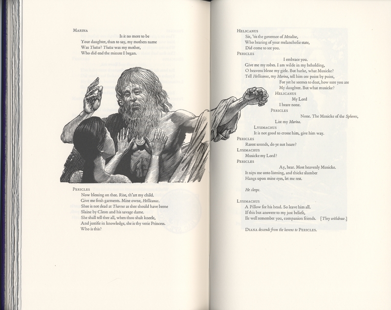
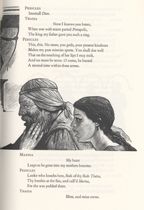
The reuniting scene between Pericles and Marina in Act V, scene ii (figure 21).
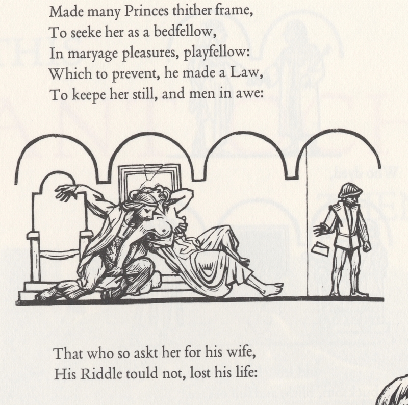
Cropped comic vignette of Antiochus' incest from Act 1, scene i (figure 24).
II. Creating an Event through Page Design
Now that we have addressed the big players in the performative medium – sound and motion – we can narrow our focus to the particulars of a play. What elements of theatrical performance distinguish one production from another? How will a director employ exciting new twists on a familiar story, without compromising the original narrative? As the theatre historian Russell Jackson confirms, the desire for originality is the driving force behind much experimentation in the contemporary theatre at large and Shakespearean theatre is no exception (230). “The audience in the 1990s will have seen warriors who are suspect,” writes Russell, “fairies with unresolved sexual problems, and clowns who might have been conceived by Dostoevsky and trained by Beckett” (230). While Jackson’s examples represent some of the stranger experiments (by no means the strangest), they point to a growing anxiety felt across the spectrum of contemporary Shakespearean productions – an anxiety prompted, it seems, by the following question: in the midst of a heavily “Shakespeared” culture, how does one make an old play new?
In his essay titled “Director’s Shakespeare,” Robert Smallwood guides his reader through the last fifty years of innovative Shakespearean spectacle, commenting on the various ways contemporary directors attempt to distinguish their own productions from the myriads of performances before them (176). For instance, as Smallwood recalls, the 1993 Royal Shakespeare Theatre production of The Tempest saw the mischievous elemental Ariel enter through a “basket, placed in the centre of an otherwise bare stage”: “a ship’s lantern is lowered from the flies to a point just above his head. Ariel . . . reaches up, takes hold of it, pauses a moment, then sets it swinging vigorously on its rope to and fro across the stage. As soon as it moves, we hear ‘a tempestuous noise of Thunder and Lightning’ . . . We have been watching an example of director’s Shakespeare” (176).
As in another example, the 1984 Peter Hall production of Coriolanus saw Ian McKellen in the title role “first appear[ing] in the suavest of white suits straight from the latest fashion magazine, but with a Roman sword swung menacingly over his shoulder” (187). These kinds of interpretations seek to highlight unexplored themes in Shakespeare and offer the plays the same sort of cultural relevance they enjoyed during their first performances. By dressing Coriolanus in a fashionable suit while in possession of an old Roman sword, Hall creates an uncomfortable convergence between the old and new. His spectacle implies, not anachronism, but timelessness and alludes to, among other things, the timeless value of Shakespearean theatre. As Jackson elaborates on this subject, contemporary audiences “will probably expect to be shown the play’s relevance to their own preoccupations, and its claims to be taken seriously may depend on their going home with a skeptical view of human happiness (if comedy) or of the achievement of wisdom through suffering (if tragedy)” (230). Interpretation is a key element, perhaps the motivating impetus, behind contemporary Shakespearean production. As such, we are led to a question: if this edition of Pericles truly seeks to mimic a performance, what design features make the Barbarian Press interpretation unique?
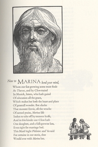
In his companion essay to the book, titled "On the Making of Pericles," Brett frequently refers to what “a theatre director might” do, or how “one can imagine a production” showcasing different spectacles or performance encounters (10-11, italics added). Indeed, Brett is deeply concerned with the spatiality of this edition’s imaginary performance and confirms that this sort of thinking influenced his illustrations. For example, Brett frequently employs comic strip-style action portraits, which depict various “staged” interactions (figure 24): “The boxes of a strip cartoon seemed a clear format for their [the actors’] successions of mime,” writes Brett, “this is one of the several sequences of engravings in consciously different styles which run through the book, sometimes played against each other as they go” (9). It is through this and other design innovations that Brett and Elsted communicate the subtle narrative nuances of their performance.
While there are many examples to choose from, the scene where Pericles and Marina are reunited perhaps best communicates some of these implicit narratives (figure 21). In this scene, Elsted’s fluid typography suggests the cadence and pitch of the conversation, lending a particular identity to the scene’s tone and mood. Furthermore, the details in Brett’s woodcuts tell us a deeper story, connecting a series of tiny narrative threads that have run quietly in the background until now. These images therefore function as the book’s version of pageantry (or its costuming and stage design) and, among other things, exhibit the distinguishing features of the Barbarian Press interpretation of Pericles.
Notice also, in figure 22, the striking contrast between Pericles’ haggardness and Marina’s youthful appearance, which echoes her mother’s portrait from earlier in the script. Indeed, this scene represents the climax of an implicit illustrated narrative, portraying Pericles’ gradual process of aging. As Brett confirms, this was his intention: “The actor playing him must go through a series of physical transformations representing these stages & the symbolic vows he takes: never to cut his hair, never to wash. These suggested the variations on a face worn by experience – more by experience than by time, in fact: the Pericles who rediscovers his Thaïsa is probably not yet forty” (12). As for Marina, the familial connection between father and daughter is confirmed through the physical similarities she shares with her mother. According to Brett, a frequently used performance tradition in productions of Pericles features the same actress as both young Thaïsa and Marina to encourage the dramatic effect of this very scene (12). This tradition was not lost on Brett, who suggests that “one wants to see just one face, both parts played by the same actor, but how, in that case, does one handle the final scene of their meeting? . . . In the book, we considered using the same block for the mother and the daughter [in the final scene], to spring the same surprise, but decided the difference in generation was more important than the identity of appearance or reappearance” (12). Perhaps even more interesting than these details, is what attending to them has to say about this edition of Pericles.
According to Smallwood, in recent years Shakespearean productions have become noticeably more aware of other productions and even critical essays on Shakespeare (177). They allude to these other works through subtle (or not so subtle) hints in pageantry, set design and other production elements. These productions are less concerned with Shakespeare’s original vision for the plays than with the director’s unique vision for the performance. Smallwood labels this relatively new approach to Shakespearean theatre, “Director’s Shakespeare”: “Director’s Shakespeare’ is a phenomenon deriving, indirectly but inevitably, from the great expansion of the academic Shakespeare industry over the last half-century and more: productions of the plays take their place in a general climate of critical thinking about Shakespeare and cater for audiences which include many who are well aware of the play and its recent critical and theatrical history and who thus provide a potentially awkward mixture with those who are coming to it for the first time" (177). Bearing this dialogue in mind, it is remarkable to note that Barbarian Press’s edition not only seeks to perform a unique production but also ambitiously responds to the historical performance dialogue linked with Pericles. This motivation, perhaps more than anything else, must prompt critics to treat this edition of Pericles as a directorial debut, in addition to a piece of masterly book design.
Concluding Thoughts
While the Barbarian Press edition of Pericles may rightly be considered unconventional, both Brett and Elsted would argue their page design is guided by the time-honoured traditions of good typography. As Bringhurst asserts on this topic, “The typographer’s one essential task is to interpret and communicate the text. Its tone, its tempo, its logical structure, its physical size, all determine the possibilities of its typographic form” (20). Though Brett and Elsted often push the typical conventions of traditional page design, Pericles remains true to these essentials. Even in the more ambitious typographic spreads – the jousting scene or the first storm scene – the text remains comfortably legible and Shakespeare’s original work (or rather its approximation, as I will clarify in the following section) is never compromised. The Barbarian edition of Pericles is first and foremost a play-text and its designers treat it as such. However, as I have previously described, it is the nature of a play-text to aspire to more and Pericles is certainly no exception. A script anticipates actors, directors and ultimately a performance. For this reason, the designers of this edition are placed in a problematic position where to truly “communicate the text,” as Bringhurst writes, they must go further than the text (20). They must find a way to “bring to life the [play’s] silences, illustrate the dumbshows, [and] articulate the voyages” (Barbarianpress.com). In a sense, the Barbarian edition of Pericles accomplishes far more than Bringhurst’s mandate for the good typographer and, rather than “communicate the text,” it seeks to embody what the text seeks to communicate – to sing anew “a tale that old was sung.” Through their innovative page design, Brett and Elsted seek to present a clearer, more robust textual experience which mimics a theatrical production, while still protecting the integrity of Shakespeare’s play. As such, the Barbarian edition of Pericles must be considered more than a script – indeed, it aspires to much more. It is, in a word, a performance.
PART IV: THE LIFE OF THE TEXT
The bad quarto editions and beyond
In this section I draw from Crispin Elsted’s essay “Reading Pericles” and other historical resources relevant to the Pericles text, chronicling its intriguing publication history. I will also discuss how this history has come to define the Barbarian Press edition and why, as Elsted asserts, “The edition of the play you are now reading, handset and printed by letterpress, is probably closer to the original quartos in point of its physical production than any edition most people will have read, or any edition of Pericles printed in the last century or more” (20).
I: Origins and "Unsavory" Co-authors
Although Pericles had first been published in several quarto editions from 1609 to 1635, the play was first published as a part of the acknowledged canon of Shakespeare’s work in the second edition of the Third Folio (figures 9 + 10) in 1664. This folio edition expanded the enormously successful First Folio – a collection of Shakespeare’s plays published in 1623 by John Heminges and Henry Condell, two of his colleagues from the King’s Men, the theatre company for which he wrote his plays. Judging from the physical evidence, scholars believe the 1609 quarto of Pericles was type-set by as many as three different compositors and that the text was likely not based on Shakespeare’s personal copy, but from a reported copy, “cobbled together by a group of actors who took part in the performances” (BarbarianPress.com). This first edition, according to Elsted, was an “unholy mess: verse set as prose; words, lines, and (it seems) whole sections of scenes . . . omitted” (BarbarianPress.com). As such, modern editors must use a series of archeological tricks to piece together cohesive approximations of Shakespeare’s original masterwork. Pericles’ modern iterations are therefore, perhaps more than any other Shakespearean play, inherently linked with the text’s convoluted publication history.
Interestingly, the second edition of the Third Folio was printed in 1664, forty-one years after the First Folio was printed. Pericles’ mysterious absence from the first, second and the first edition of the third folios raises some troubling questions: what prevented Heminges and Condell from including Pericles in the first folio of 1623? Did they believe the text to be corrupt, controversial or possibly not written by Shakespeare? Scholars have sought to answer each of these questions in numerous ways and have been met with varying degrees of success One intriguing possibility has to do with Pericles’ earliest pirated publications.
According to Elsted, prior to the third folio edition Pericles had been published in quarto format no fewer than "six times” (27). Long before copyright laws were enforced, early modern artists were constantly at risk of having their works plagiarized. These early quarto editions of Pericles, like many other quartos of his plays,were likely pirated editions, either hurriedly copied by scribes in short-hand during the performances or reconstructed by actors who had participated in the performances. Their labors resulted in a series of very poorly managed texts, which frequently strayed from Shakespeare’s original intentions (figure 11). For obvious reasons, these versions came to be known to scholars as “bad quartos,” although, as Elsted asserts, however poorly assembled they might be, they still confirm the play’s popularity during the first half of the seventeenth century (17).
As Elsted reports, some scholars suggest that the play’s history of textual piracy had left it tainted in the eyes of the early editors and thus prevented them from including Pericles in the first series of folio editions (17). However, as Elsted later counters, this reasoning is unlikely, given that Heminge and Condell were Shakespeare’s friends, and therefore more likely to publish a corrected edition of Pericles to ensure the integrity of their friend’s work (17). Another explanation has to do with the possibility of co-authorship.
Indeed, Elsted agrees with some other editors that Shakespeare’s friends might have excluded the play from the first and second folios because the text was not wholly Shakespeare’s (17). While there is no longer much debate regarding the third and subsequent acts, scholars continue to hotly debate how much of the first two acts are by Shakespeare. Many assert that the style is atypical of Shakespeare; the pacing faster, the poetry lacking in luster and the events bordering on melodramatic. Essentially, the first two acts present a fast-and-dirty approach to drama, which many agree is decidedly un-Shakespearean (Gossett; Taylor and Jackson). For these, and other reasons, critics have suggested that Pericles is a collaborative effort, not an uncommon practice during the period when the play was likely written (Gossett; Taylor and Jackson). In fact, as theatre historian and Pericles editor Suzanne Gossett writes, “The years 1601-10 had the highest percentage of collaborative playwriting of any decade between 1590 and 1720” (qtd. in Elsted 57). As such, it is no surprise that during this – his first experimentation with the romance genre – Shakespeare partnered with another writer, perhaps more familiar with this new style. While a simple collaboration would do little to harm Shakespeare’s public image, Shakespeare’s choice in partners is another story entirely.
There has been much speculation and controversy surrounding the rather shadowy Renaissance figure George Wilkins. As Elsted writes, “George Wilkins—poet, playwright, publican, & pimp—is a murky figure, many of whose biographical details spring from criminal actions brought against him. He was by all the evidence a particularly unsavoury character” (31). Among other less admirable talents, Wilkins was widely known for his wit and energetic playwriting. He was a man of the times and perhaps offered Shakespeare needed confidence when exploring alternative forms of drama, namely, the “romance.” “Romance,” as Russel MacDonald defines in The Bedford Companion to Shakespeare, “threatens its audience with disaster or death and abruptly changes gears so that the action comes to a happy ending” (167). They are comedies with elements of tragedy, often including mystical elements and (especially in Shakespeare’s romances) reunions of people who were thought dead. In some cases – for example in Pericles and The Winter’s Tale – these reunions amount almost to resurrections. With no less than three ship wrecks, a jousting scene, assassins, incest, espionage, a resurrection and a riddle match with mortal consequences, Pericles is certainly an explosive entry into the romance genre.
In addition to his reputation as a talented playwright, critics point to Wilkins as Shakespeare’s collaborator for a number of reasons. Firstly, the phrasing and the style in places reads very similarly to Wilkins’ other works. Secondly, Wilkins published a romance novel generously titled The Painful Adventures of Pericles, Prynce of Tyre in 1608 – a date which straddles Pericles’ earliest performances. Very likely, Wilkins helped Shakespeare draft Pericles and – ever the industrious business man – wrote a companion novel while the play was still a hot topic of conversation. Its title makes the connection with Shakespeare’s play explicit: The Painful Adventures of Pericles, Prynce of Tyre, being the True History of the Play of Pericles as it was lately presented by the worthy and ancient Poet, John Gower. In light of Wilkins’ suspect reputation, it is possible that, to protect the memory of their deceased friend, Shakespeare’s colleagues decided against the publication of Pericles to avoid any connection with the “unsavoury” Wilkins (Elsted 31).
What does all this have to do with the Barbarian Press edition of Pericles? Quite a lot in fact. The Wilkins collaboration dispute has been a polarizing controversy over the last century. Regardless, Elsted’s edition, as with a number of more recent publications, makes generous use of Wilkins’ romance, filling in gaps in the third folio narrative with text from Wilkins’ novel. Elsted resembles other recent Pericles editors in this way, particularly Suzanne Gossett in the Arden edition (2003) and Gary Taylor and MacDonald P. Jackson in their Reconstructed Text in the Oxford Shakespeare (1986), which was later separately republished and further edited by Roger Warren. As Elsted asserts, “All these [versions] scrutinize the text in its various editions from the first quarto of 1609 to the present” and seek, above all else, to represent Shakespeare’s original version, which is of course forever lost to us (66).
The best editors can do is examine the many versions of the text available to us – bad quartos included – add a healthy helping of intuition, and reconstruct the text as seamlessly as possible. As Elsted writes, “The quarto is an acknowledged mess in many ways, and if one decides not to leave it just as it is, the question is whether one cleans up the mess with a mop or a pair of tweezers. I have elected to use, as intermediate tools, a dust-pan & a small brush under strong light” (68).
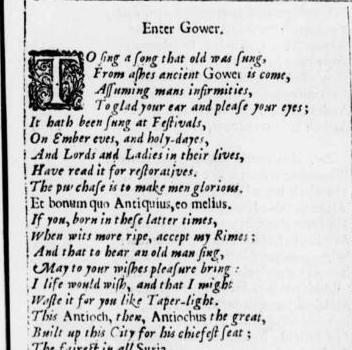
Cropped image of the Gower's opening monologue in the Third Folio second edition of Pericles, Prince of Tyre (figure 29).
II. A Note on the Spelling
In addition to acknowledging Wilkin’s influence, the Barbarian Press edition of Pericles echoes its publication history in other ways. As I mentioned earlier, the spelling of this edition follows the early modern quarto and folio editions – down to the occasional differences in spelling between certain words like “deed” and “deede.” As Elsted reminds us, “spelling in Shakespeare’s era was not fixed,” but rather left to the interpretation of the artist, poet or compositor (21). The belief that the 1609 quarto edition of Pericles was text-set by at least three compositors largely resulted from scholars’ noticing three unique spelling styles emerging in different sections of the play. To avoid confusion, Elsted regularized the spelling of certain words, such as “then” and “than,” which were often used interchangeably.
Elsted suggests a number of reasons for the importance of maintaining the early modern spelling. For one, it changes the way we read the text. “The loss of Elizabethan punctuation subtly alters the music of the speeches,” writes Elsted, and cites G. B. Harrison’s point that the difference can be understood as a “piece of music played by an amateur & the same piece played by a professional” (67). For instance, in Gower's opening monologue (figures 28 and 29), the word "holidays" is instead spelled "holy-dayes" in both the Third Folio and Barbarian editions—a difference which considerably alters both the phonetic resonance and connotation of the word. Indeed, the phonetic quality of “holiday” and “holy-daye” are decidedly different. While the number of syllables remains consistent between either spelling, there is a greater emphasis on the first syllable in "holy-daye" which is pronounced as a long vowel “ō”; whereas, the reader's tongue skips quickly over the short vowel “o” in “holiday.” As a result, the contemporary spelling slightly diminishes the lyrical quality in the Gower’s opening monologue, compromising the pattern of phonetic stresses in line six. Furthermore, unlike the standardized version of the word "holiday" which has come to mean a day of rest and recuperation, "holy-daye" derived from the Old English haligdæg, according to the Online Etymology Dictionary, refers to a “consecrated day, religious anniversary” or “Sabbath” and thus carries with it religious significance (etymonline.com). In this way, the reader is given insight into the early modern understanding of the word and, through other similar encounters with the early modern spelling, subtly encouraged to consider an early modern experience of the play. As Elsted maintains, while the spelling in this edition is not Shakespeare’s, it retains much of the phonetic nuance and musicality that would have been present in Shakespeare’s foul papers (his manuscript of the play) (67). For this reason, Elsted includes the early modern spelling, in an attempt to bring the Barbarian Press edition one step closer to Shakespeare’s original manuscript.
ACKNOWLEDGEMENTS AND ADDITIONAL READING
I would like to thank Crispin and Jan Elsted for agreeing to be interviewed and their ongoing involvement in the development and editing of this page. I would also like to thank the Special Collections department at the University of Victoria for their diligent assistance in these OMEKA exhibits and for maintaining, cataloguing and protecting Pericles and other literary works of special significance. Another thank you to Heather Dean for her guidance in drafting a series of meaningful interview questions. Finally, many thanks again to the Elsteds for creating this incredible piece of press work.
Interested in more Pericles and dynamic page design?
For those who want to see more of Pericles, follow this link to a page-by-page video tour of this edition. Also, for those interested in another example of dynamic page design, follow this link to view a pdf of Scott McCloud’s work Understanding Comics.
Works Consulted
Bate, Jonathan & Russell Jackson. Shakespeare An Illustrated Stage History, Oxford University Press, 1996.
Bil’ak, Peter. “Experimental typography. Whatever that means.” Typotheque, online resource, January 23/05.
Brett, Simon. “On the Making of Pericles.” Reading Pericles, Barbarian Press, 2010, pp. 1-14.
Bringhurst, Robert. The Elements of Typographic Style. Hartley & Marks, 2004.
DelVecchio, Doreen and Anthony Hammond. “Introduction.” The Play of Pericles, Prince of Tyre: The New Cambridge edition, edited by Doreen DelVecchio & Anthony Hammond, Cambridge University, 2014, pp. 1-85.
Elsted, Cripsin. “Reading Pericles.” Reading Pericles, Barbarian Press, 2010, pp. 15-47.
Fellows, Kara S. Typecast: The Voice of Typography. University of Iowa, 2009.
“First Folio Facts.” First Folio, U of Arizona, posted 2015, accessed Oct. 25/17.
Foakes, R. A. “Shakespeare’s Elizabethan Stages.” Shakespeare: An Illustrated History, ed. Jonathan Bate and Russell Jackson, Oxford University, 1996.
Gossett, Susan. “Introduction.” The Play of Pericles, Prince of Tyre: The Arden Edition, ed. Susan Gossett, Bloomsbury Academic, 2004.
Hayward, Michael. “The Gutenberg Effect: Living a Handmade Life.” Geist: Ideas + Culture, Metro Publisher, 2017.
"Holiday." Online Etymology Dictionary. Douglas Harper, 2018.
Jackson, Russell. “Shakespeare in Opposition: From the 1950s to the 1990s.” Shakespeare: An Illustrated History, ed. Jonathan Bate and Russell Jackson, Oxford University Press, 1996.
McCloud, Scott. Understanding Comics: The Invisible Art. Kitchen Sink, 1993.
McDonald, Russel. The Bedford Companion to Shakespeare. Palgrave Macmillan, 2001.
Purvis, Meggs. Meggs’ History of Graphic Design: Fourth Edition. John Wiley & Sons, 2006.
Shakespeare, William. The Play of Pericles, Prince of Tyre. ed. Crispin Elsted, Barbarian Press, 2010.
Shakespeare, William. "The Play of Pericles, Prince of Tyre." Third Folio, Chetwinde Philip, 1664, Internet Shakespeare Editions.
Smallwood, Robert. “Directors’ Shakespeare.” Shakespeare: An Illustrated History, ed. Jonathan Bate and Russell Jackson, Oxford University Press, 1996.
Shakespeare, William. The Late and Much Admired Play, called Pericles, Prince of Tyre. Henry Gosson, 1609, Internet Shakespeare Editions.
Taylor, Gary and MacDonald P. Jackson. “Introduction.” The Reconstruction of Pericles, Prince of Tyre, edited by Gary Taylor and MacDonald P. Jackson, Oxford University Press, 2003, pp. 1-71.
“The Play of Pericles by William Shakespeare.” Barbarianpress.com, online article, 2011.
Welhausen, Candice A. “Toward a Topos of Visual Rhetoric: Teaching Aesthetics Through Color Typography.” Journal of Technical Writing and Communication, online journal, May 6/16.
White, Jan. Editing by Design: For Designers, Art Directors, and Editors—the Classic Guide to Winning Readers. Allworth Press, 2003.
White, Jan. Great Pages: A Common-sense Approach to Effective Desktop Design. Serif Publishing, 1990.
Wiggins, Martin. “The King’s Men and After.” Shakespeare: An Illustrated History, ed. Jonathan Bate and Russell Jackson, Oxford University Press, 1996.
GB/Fall2017

![[Untitled] [Untitled]](../../../../files/thumbnails/640cd841de9b3218bea9e47b57300d11.jpg)
