BLAST: review of the great English vortex (1914-15)
")
Cover Page of Rubaiyat published by Hodder & Stoughton
")
Cover of The Picture of Dorian Gray

Cover of the second issue of Woman's World, edited by Oscar Wilde
The Visual Landscape
In the late 1800s, magazine and print culture in England had become an enormous industry with a significant focus on visual design. Due to the lifting of tariffs and duties on advertising, “advertising and printing were now cheaper, and as a result Britain was flooded with new magazines and newspapers, many supported by money earned from ads” (Reynolds 242). The swelling middle class as a result of the industrial boom also led to a huge and literate market for these products. As a result, magazines on all sorts of subjects and for all sorts of people proliferated throughout London, which was a huge metropolis as well as the seat of the British empire. Many established magazines lasted for decades and some continue to exist today, but many others were short-lived, competing with one another for the time and money of a content-flooded consumer base. Magazines used their design elements to stand apart from their competitors or to associate themselves with more popular magazines.
While the Impressionist movement and the later Cubist and Futurist movements challenged what constituted “art”, the major literary and visual movement for the majority of this period was Aestheticism. Figures such as Aubrey Beardsley and Oscar Wilde were prominent in this movement. Many literary or hobby magazines used highly ornamental and aesthetic decorations in order to attract customers or stand out from their competitors, creating a visual identity unique to their magazines similar to the magazines in a modern supermarket. Different colors for the cover were also used to differentiate magazines as well. A decorative and distinctive cover also served a double purpose. In addition to catching the eye of a prospective buyer, the periodical style visibly marks out the owner to anybody who sees them reading the magazine in a cafe or on a train. The more stylized and colorful a magazine, the greater the effect. In order to signal the reader as having refined tastes, a magazine that is associated with the higher class being recognizable as such is a very desirable commodity. More provocative magazines such as the Yellow Book were also markers for urbanites who wished to project a cou nterculture identity. However, as more magazines were created, the market became flooded. Attempts to create more recognizable and distinctive covers just resulted in a spectrum of covers, each of which becomes less distinctive when placed together on a busy newsstand.
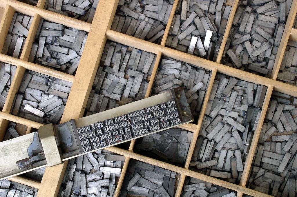
Fonts were relatively uniform. Crafting a new font meant carving out the lettertype to have it cast for a printer’s, a time-consuming and costly endeavour. As a result, there were very few fonts in circulation. Because fonts were so few, they were more easily recognized and became associated with their standard subject matter. For example, the 17th-Century revival font Caslon old-face “became the type-face of deliberate and principled reaction or anachronism” (Dowling 124), which put it in line with the Aesthetic movement’s medieval sensibilities. Caslon old-face or other gothic fonts were popular for the more aesthetic magazines, especially ones that wanted to elevate their subject matter. Being more difficult to read than simpler, more modern fonts, which prioritized the visual and aesthetic message of the magazines over the readability of the contents. Requiring more time and effort to read the literature also elevated it as being implicitly worth more time and effort to enjoy.
As seen here, while the covers of many books and magazines during this time are well-decorated and beautiful, when pictured together in a group they become less distinctive. The busy and intricate design is less distinctive when surrounded by other designs that are busy and intricate.

Cover of Blast, rebound upside-down.

Internal frontispiece of Blast

Contents of text and illustration in Blast.

Vorticist art within Blast

Publication and subscription information at the end of Blast
The Magazine
Blast was printed in July 1914 by the John Lane publishing company, and edited by Wyndham Lewis. It was a concentrated effort by Lewis and his circle to create a distinctive and cohesive avant garde style and to brand it as being English. Of immediate note is that the word "blast" is a mild curse in British English, branding it as a sort of in-joke. Its cover was a brilliant pink, described variably as fuchsia or puce, with the title, “BLAST”, emblazoned diagonally across its surface in thick black font in a performatively attention grabbing design. The copy of Blast in the UVic Special Collections has been hardbound; originally, Blast was a softcover magazine, despite its size. Of particular note is that when the UVic copy of Blast was rebound, the cover was rebound upside-down. Originally, the magazine was printed with the title being read from the upper left to the lower right, but the copy that UVic has is read from the lower left to the upper right. Nonetheless, the cover remains readable despite this gaffe. Its typeface was a very modern and readable, the aptly named “Grotesque No. 9”. The magazine is large, 30 cm high and 23 cm wide, and its size as much as its color and typeface made it stand out.
After the cover and the frontispiece with publishing information, there is a page of errata, caught after the initial printing, and then a table of contents listing the contributions to Blast. The next page features the images, and is titled “Illustrations,” which is a term artists rankled at. In many literary magazines, the literature took primacy, which drove visual artists to feel a “resultant subordination as mere illustrators” (Dowling). However, Blast was designed as a journal to promote a movement in visual arts. Any name or description given to the art within it is operating under the understanding that the art and the artist is the object of primacy to Wyndham Lewis’s ideals and Blast itself. The illustrations are ordered differently to the “contents”, with the artists’ names given precedence and then the list of the works displayed. The paper used is not of a luxurious quality as some more aesthetic bound books and magazines were printed on; it has a noticeably rough texture. The paper quality however may have had more to do with the attempt to keep costs down than any artistic intent. The art prints, however, are on a much glossier and more constructed paper. It’s smooth to the touch, and holds the art images very well. Many pages of the lower quality paper also have graphical designs on them as part of the layout, even including the “errata” page.
As opposed to most magazines that featured both literature and art, the poems and stories contained in Blast are not linked. Considering the Vorticist move away from figural representation and towards greater abstraction, this is not surprising. That being said, as Vorticist art is intended more to express a feeling and mood than tell a story or display a distinct picture, the art in Blast may very well fit together with all of the literature presented.
The most-quoted and most recognizable features in Blast are the manifestos that preface the rest of the content and then the “Vortices and notes” that end the journal. Featuring very dramatic and avant garde typography, the early first Manifestos have lengthy lists of things and people that Wyndham Lewis and the Vorticists wished to either “Blast” or “Bless”. As the most typographically and visually daring of the text pages as well as the ones that most directly espouse the Vorticists’ artistic intentions as envisioned by Wyndham Lewis, the contents of the manifestos and Vortices receive the most critical attention. The ending manifestos and writings by Lewis and Gaudier Brzeska are closer to an actual declaration of artistic intent than the first “manifesto”. After the content of the magazine proper are the advertisements that list the other products that John Lane publishes.

Poem by Ezra Pound

Prints from Frederick Etchells in Blast

The blackouts on this page are legible in the UVic version but not in some online versions

Note the small decoration
Art and the Magazine
Blast occupies a peculiar space with regards to the tension in magazines between the visual and the textual. It was highly influenced by the Italian Futurist movement, as Futurist impresario Filippo Tommaso Marinetti spent much time in London and Wyndham Lewis was heavily inspired by Marinetti’s tactics in promoting his artistic ideals as well as Marinetti himself (Edwards 15). Wyndham Lewis’ main circle were visual artists, so there was no mistaking that visual art would stand alone from and not be subordinate to any written art. However, manifestos and declarations of artistic philosophy are vital for the kind of avant garde movement that Lewis was trying to initiate.
While Lewis and his circle of artists were formulating this idea, however, the american poet Ezra Pound had situated himself in London and had by this time become an Imagist leader. Pound’s techniques in literary circles were also drawn from Marinetti. Pound and Lewis were close friends, and Pound gave support to Lewis’ early attempts at creating an art movement. As a result of their friendship and cooperation, issues with the supremacy of word over art or vice versa were not divisive issues (Edwards 16). Displaying and promoting the overall aesthetic philosophy of the Vorticists was the primary goal of the journal; the visual artworks themselves and the manifestos and poems that fit in with these ideals went hand-in-hand. Of particular note is Wyndham Lewis’ The Enemy of the Stars, a single-act play written by him and prefaced by a printing of his own visual art to accompany it.
Wyndham Lewis also bore similarities to Aubrey Beardsley, the art editor of the literary periodical The Yellow Book, albeit they worked a generation apart and had different artistic philosophies. Both were visual artists who worked as creators and editors of art magazines, and both also worked in prose and literature. However, while Beardsley was working in an established milieu of literary and magazine culture, Wyndham Lewis was trying to establish a new avant garde method of artistic delivery. Lewis and Pound’s focus on the Futurist art movement and exhibitions that they wanted to emulate gave them a concrete focus for their journal. Considerations of text-art balance took a secondary role in comparison to the goal of a fully realized avant garde movement. As a result, Blast was designed more as an artistic manifesto or pamphlet than a literary magazine. The freedoms and focuses that Lewis was concerned with in addition to his own avant garde influences such as Marinetti’s Zang Tumb Tumb allowed the editing processes of Blast to ignore many of the problems and arguments that earlier literary magazines suffered from.
Because of his association with and interest in the modernist movement, Lewis would have by necessity rejected the old-fashioned aesthetic sensibilities that were still popular in England. While Lewis would plumb English culture for visual and stylistic codes in Blast in order to subvert and break them, there were as of yet insufficient avant garde English magazines for him to be influenced by.

The first page of Blast's first manifesto. Note the bold typeface

Small designs interspersed with avant garde typography

Wyndham Lewis' play in Blast, prefaced with an abstract illustration and a faux advertisement. Lewis has here juxtaposed the advertising format with both visual art and literary arts.

Example of English advertisements, and the visual similarities to font with the contents of Blast

Note the variation in font size, comparable to Blast's manifesto
BLASTing away all boundaries
Blast is not just a title. The word has many meanings and uses. Firstly, at the time in England, it would have been read as a mild expletive, similar to “damn” today. Secondly, it can be read as a noun. Is this book itself the blast that it mentions on the cover? Thirdly, blast is a verb. Blast could be a command as well. Is this book a blast, is it blasting something, or is it instructing or demanding the reader to do some blasting of their own? With only a brilliant fuchsia cover and the word “Blast” emblazoned on the front in thick letters, a reader has to peruse the book to discover exactly what the title means. In this way, the name of action galvanizes a reader to take action themselves, forcing them to actively interpret and actively pursue the magazine.
The contents of Blast are not obstructed by an ornamental or hard to read font. Despite the fragmented sentences and seemingly confused statements, the typeface for the manifestos are large, readable, and clear. Combined with the size of the magazine, the large and modern font makes the words easy to read even at a distance or to someone with poor eyesight, while still provocative in content. As opposed to Caslon old-type or other Gothic fonts used for many other literary periodicals, Blast is printed in a very easy-to-read typeface. There are no obstacles between the text in Blast and the reader.
While Wyndham Lewis did not have a tradition of English avant garde art magazines to draw on for visual inspiration, there was a well-developed English print genre that he made copious use of - advertisements. Filippo Tommaso Marinetti was a prolific advertiser and promoter and also well acquainted with Wyndham Lewis. However, Marinetti’s Italian Futurist movement became critical of English art, and “Lewis immediately dissociated himself and his movement from the futurists”(Reynolds 144). In order to help visually distance himself from the Futurists, Lewis made use of the developing aesthetic of English advertising in Blast, particularly the manifestos.
Using the visual language of advertisements in order to create clearer readability and greater visual impact was a calculated move that had another dramatic implication. Blast conflated avant garde artistic production with the consumer advertisement culture, undercutting a seperation of the high and low arts. The difficult-to-read fonts of the aesthetic magazines reinforced this ideal; art should be difficult to access, a luxury for those who were wealthy and tasteful enough to appreciate it. Setting the journal of a new avant garde art movement explicitly to resemble an advertisement, that lowest of illustrations, would “reject the long tradition of the bourgeois academic art that these represented”(Reynolds 244).
Blast was a magazine that tried to do what it promised. It wanted to blast (as in damn) what it saw as insufficient or wanting in society, and its manifestos did exactly that. It wanted to be seen as a blast, a riotous explosion of energy and power like the metaphorical vortex that the Vorticists took their name from, and the backlash from the aesthetics that it set itself against imply that it did just that. Blast wanted to blast apart conventions of art with its non-representative plates and unconventional typeface. What’s more, Wyndham Lewis wanted to blast - in all sense of the word - what he saw as the snobbery and pretension of the established community that controlled and dictated the merits of art. Lewis wanted to create a juxtaposition of the artistic and the commercial, of the highbrow and the lowbrow, to democratize his new form of art and rob the aesthetics and snobs he disliked of their moral superiority. In Blast, released under a month before the start of the first World War, demonstrations of all these aims are clear.
Works Cited
Cottington, David. “The Formation of the Avant-Garde in Paris and London, c. 1880-1915.” Art History, vol. 35, no. 3, Apr. 2012, pp. 596–621.
Dowling, Linda. “Letterpress and Picture in the Literary Periodicals of the 1890s.” The Yearbook of English Studies Vol. 16. (1986). pp. 117-131.
Edwards, Paul. Blast: Vorticism, 1914-1918. Aldershot, Hampshire, England, Ashgate, 2000.
Gasiorek, Andrzej. “The 'Little Magazine' as Weapon.” The Oxford Critical and Cultural History of Modernist Magazines, Oxford University Press, 2013, pp. 290–313.
Lewis, Wyndham, editor. Blast: Review of the Great English Vortex. vol. 1, London, John Lane, 1914. UVic SC Call number PR6023 E97Z6129 no. 1
Reynolds, Paige. ""Chaos Invading Concept": Blast as a Native Theory of Promotional Culture." Twentieth Century Literature 46.2 (2000): 238-268. Web.