The Red Badge of Courage, Several Editions, by Stephen Crane
On the neatness of books, and why they're anything but.
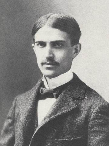
Stephen Crane (Figure 1): author of, among other things, The Red Badge of Courage, presents just as many problems today as he did back in 1895, when this famously powerful civil war text brought him to international attention. Born in 1871, he lived as a mayfly, the fate of many powerful wordsmiths: dying in 1900 before his 29th birthday (Sorrentino 12). Just as his powerful narrative, following Henry Fleming, a soldier physically and emotionally ravaged by the rigours of civil war, refuses to become a mere collection of 'dead words', so too does Stephen Crane’s brightest work refuse to dim.
Given how far we have come in the past some hundred years after his passing, and after the publication of The Red Badge of Courage, we could forgive the average person for questioning the relevance of The Red Badge of Courage at all, given the period it depicts; a flashpoint in history, certainly, but very much part of the past and not our future. “Who cares about this old book nowadays? Who cares about the civil war, even?” one might ask. And, to a certain extent, they would be perfectly right to do so.
While the given idea of books is as 'dead' works: works that, once set in type and sent to the printers, never change or meld, I will through the course of the article highlight some of the continued wrinkles that persist even in incredibly important and well-read texts such as The Red Badge of Courage. More than most people think goes into preparing and selling a text such as The Red Badge of Courage: troubles may be sourced from different manuscripts to the considerations taken by the publisher, editor and, occasionally, the author. And while one would think that, after over a century of debate and critique, that the literary community would have settled this debate, the critical war is far from over.
So, in this essay, I hope to bring to your attention some of the key facts from this skirmish: the various manuscripts, the executive decisions, and the interesting variety that can exist even in a 'solid' text. I’ll prove to you why this book, read by millions over the course of a century, may exist in just as many forms, bringing each reader to a fundamentally different conclusion of its overall message. I’ll show how supposedly minor fads can fundamentally change how a work is created and perceived, and how the notion of a text’s place can shift hugely depending on where you happen to pick up a copy. I’ll show how the 'variorum' contains texts so wildly different from those that you read in high school, that it constitutes a different text entirely. Becuase as readers we have to recognise that “complete” texts are often anything but.
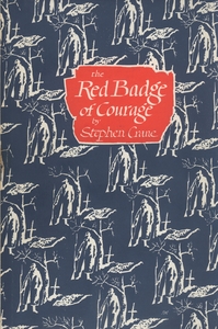
Figure 2: The cover of The Red Badge of Courage by The Peter Pauper Press. See how the stark contast between blue and red creates a striking "Red Badge" of its own.
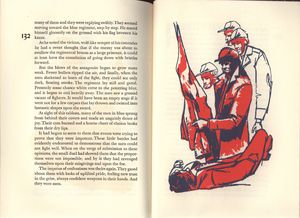
Figure 3: Example of the color illustrations in the Peter Pauper Press edition. See how it is given an entire page, and deals strongly in contrast? It therefore lends a strength to the narrative absent in other editions.
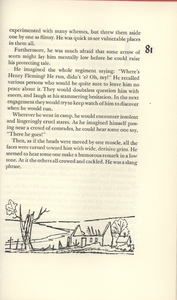
Figure 4: An Interstitial drawing occuring alongside the text in The Red Badge of Courage. The destroyed homestead gives new context to the passage.
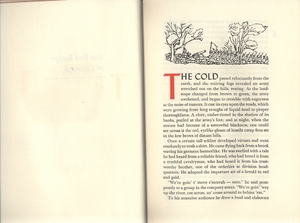
Figure 5: The grand opening to the Peter Pauper Press edition of The Red Badge of Courage. Note the gravity of the drop caps and the striking red lettering.
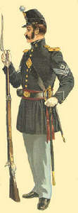
Figure 6: An example of Union uniforms, from plates by Henry A. Ogden. In the Public Domain.
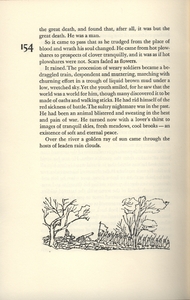
Figure 7: The final page of the Peter Pauper Press edition. Note the stark finality of the white space, and the re-occurence of the army marching forwards.
"He hit again upon nature... her grim dogs upon his trail" - The Power of Illustration
While we are comfortable with talking about the “art” of the written word we rarely, if ever, talk about the more direct works of art that stare at us so often from the page. The author, and his authorial voice, are so well documented and discussed as to be assumed for even the loosest of pamphlets and ephemera. But when a book is created from the manuscript text, now edited into 'fair copy', there are still a many decisions to be made, from typesetting to illustration. Which brings us to this beautiful edition from The Peter Pauper Press.
Published in 1954, nearly sixty years after The Red Badge of Courage’s debut, The Peter Pauper press had full knowledge of the gravity of the task ahead of them. Founded in 1928 and still around today, they proudly bill themselves as purveyors of “fine gift books” (About Us); this edition more than fits their ideal of “handsome, finely bound” (Company History) volumes. Though their name stems from their motto of “prices even a pauper could afford” (ibid), this particular edition would have sold for roughly $130 CAD in today’s money at its lowest valuation (Measuring Worth). It justifies this large expense through a number of methods. For one, full colour printing features throughout, showing in the striking red of the initial drop cap all the way through to the full colour illustrations that feature periodically. If we observe Figure 5, we see that, with the elegant page numbering, generous margins for observations and illustrations, and high-quality paper, this edition is as much an aesthetic experience as it is a literary one.
The Overt Illustrator
That is not to even mention the cornucopia of lavish full colour drawings by one Aldren A. Watson, a prolific illustrator of books who passed away only recently, in 2013. During his life, he supplied “over 175 books for children and adults” (Biography) with illustrations of a powerfully evocative bent. To imply that Watson directly affects the books that he illustrates for, I do not even have to put words into the man’s mouth: his homepage plainly states that “his books transcend their purpose… in many ways [becoming] Watson’s chosen medium” (Home).
And if we take an artistic look at the illustrations, it is clear that Watson’s illustrations add a great deal to this version of The Red Badge of Courage. As seen here in Figure 3, the strong reds and blues depict key moments and battle scenes in The Red Badge of Courage with an impressionistic overtone that belies Watson’s realistic bent. In terms of positioning, these illustrations are given their own full unnumbered pages, creating an illustrative intervention into the narrative, “slicing” key scenes in two. Through modernist refractions of the battles, Watson indexes bloodshed without ever portraying it directly: an accomplishment in and of itself emblematic of his command over the medium. The fact that he never displays open bloodshed is important: Crane’s narrative has no shortage of bloody scenes, but Watson chooses to only imply bloodshed, possibly due to his political beliefs. He was a conscientious objector to World War Two (Biography), and through his illustrations, he chooses to deny the brutality of conflict any subsidiary glamour in his full-page interdictions.
The Peace of Patriotism
Even more strikingly, the dark blues, reds and whites also call to mind the Union uniform (Figure 6) that Fleming wears throughout, and index the historic overtones that The Red Badge of Courage, by 1954, would have been well steeped in. And further, regardless of the side that the reader would most identify with in the conflict, the colour palette draws a direct link to the red white and blue of The Star Spangled Banner. Again, this encourages a subtle dialogue with the text: Fleming spend the latter half of the books as a standard-bearer: earning his “Badge of Courage" by keeping the flag front and centre, overcoming his previous cowardice. More than a few lines physically tie Fleming to the flag, imagining him as a human extension of the flag itself, a “convenient rail support” (Crane 149). Moreso than any other edition presented in this analysis, the Peter Pauper Press edition luxuriates in the quiet patriotism of the text, celebrating this unique American achievement.
Watson influences the text in another, more subtle way: through the use of interstitial drawing and spacing. In Figure 4 we see a destroyed homestead, and are therefore pressed to reflect on the destruction wrought by war. Yet the text only contains Fleming reflecting on his earlier cowardice in abandoning his comrades. No homestead is mentioned, but Watson here plants the image in the reader’s mind, guiding their construction of the landscape. Further, the re-occurence of the opening image on the final page (c.f. Figures 4 & 7) brings a powerful circuitry to the proceedings, evocative of a subtle structural analepsis. Finally, in spacing, the emptiness of the page creates powerful imagery without a single word uttered by the author. Occurring on 149 (after a triumphant final push) and again on the final page (Fleming now turning his thoughts towards peace), the stark blankness forces the reader to reflect on the quiet futility of war which, together with the subtle illustrated rondo previously mentioned, gives a visually enervating conclusion. Watson wishes to withdraw from the violence and bloodshed; perhaps explaining why he doesn't list The Red Badge of Courage in his Bibliography (Bibliography). To summarise, the Peter Pauper Press serves up a powerful, effective edition that demonstrates the ability of a savvy illustrator to inflect the meaning of a text.
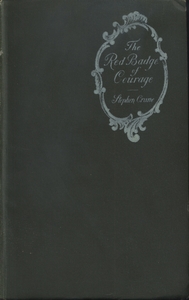
Figure 7: A copy of the Heinemann edition of The Red Badge of Courage. Note the sparseness: This allows Heinemann to undercut their competition at 3 shillings a novel, c.f. to the standard 6 shillings at the time.
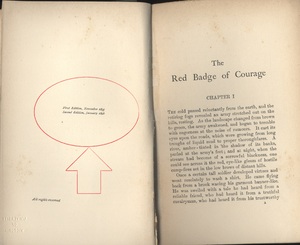
Figure 8: The opening pages of the Heinemann editon. Note how, in less than six months, Heinemann were on their third edition: with one of the first British editions of The Red Badge of Courage, they had captured lightning in a bottle.
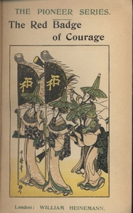
Figure 9: The asian-influenced illustration lends an ameliorating edge to the battles depicted that aimed to strike a chord with the late-Victorian audience. The illustrator, unlike Watson, is never supplied.
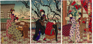
Figure 10: This ukiyo-e triptych - “Illustration of Singing by the Plum Garden” by Toyohara Chikanobu, shows the marriage of Victorian and Japanese aesthetics of the period. 1887. In the Public Domain.
Leading the Way: The Power of Illustration - Part Two
Moving on to the British-led Pioneer series volume, we have an altogether different set of conceits and concepts at play here. Constituting a fundamentally slimmer, more compact tome, the considerances are far less emphasised. Gone are the patterned covers, the heavy set text, the thick calligraphy-esque page numbers and the generous margins (Figure 8). Instead, all these more modern conventions have given way to a decidedly more perfunctory mode of stolid type and a discrete, portable page size. In other words, quantity rules the day over quality.
A Seller's Market
Part of this was the time in which it was published: 1896, just two years after the initial New York serial press release of The Red Badge of Courage. Demand was therefore still very high for this edition, particularly as until then the book had not been collected together into a set “novel” text. Also, Heinemann, through the Pioneer brand, were playing to their market: The British public was hungry for this genre-defining civil war text from “across the pond”, and presses like Pioneer and others were more than happy to service this demand, provided that they could be the first into the market place. This meant taking less care and printing not for future archival, but for immediate consumption. Indeed, in "British Books", a publisher circular of the time, Heinemann remarks that the Pioneer Series, selling at "three shillings per net... have done remarkably well" (50), mostly due to how they undercut the common price point of "six shillings per novel" (ibid). This explains also the decidedly barren front cover (Figure 7): simply an ink stamp badge on solid forest green. Covers like these were not hard to find on a shelf: they did not depict specific stand out texts but rather worked more as filler. The Pioneer Series edition wraps itself in this cover not to 'show off' the text, or to be the pride of one’s collection: rather, they seek to be passable enough to not embarrass one’s bookshelf, while still being affordable enough to cash in on a captive market.
The Mikado of Print Culture
Let’s now turn our attention to the illustrations, which differ amazingly from the Aldren A. Watson's illustrated edition published over fifty years later. The illustration (see Figure 9) depicts four figures, two of which carry a banner depicting the character “拓”or “to lead”: a fitting declaration given the content of the book. The strangeness comes from the delicate, flowing nature of the figures involved. Both effeminate and ill dressed for war, with delicate and ornate silk robes and nary a weapon between them as they sound instruments. If anything, they would seem the polar opposite of the gritty, realistic depictions of war The Red Badge of Courage was lauded for. And regard as well the colour scheme: the pale yellows, deep greens and solid blacks arguably do a lot less to show the brutality of the content than the earthy nature of Watson’s depictions. Rather, the delicate aesthetic of these ukiyo-e style drawing ameliorates the harsh edge of the brutality of war so lauded in this text. So in short: why would Heinemann choose this to portray what is fundamentally an enervating American text?
This strange choice is partially explained by the British infatuation at the time for all things Japanese. Initiated by America's contact with Japan in 1859, the following years were marked by a rapid removal of the exclusionary practices Japan had engaged in to protect what it saw to be the integrity of its cultural heritage. A complex mixture of a begrudging acceptance and appreciation of the “pure, childlike acceptance of nature” (Jackson 249) belied an incoming growth of Japanese influences in the various art spheres of the West. And, given the Meiji restoration of 1868, which only increased the adoption by the Japanese of “Western modes of production and political and economic organisation” (250), the two cultures would become inseparably linked. Figure 10 shows an example of these cross-cultural experiences. Heinemann’s illustrative choice would have been, rather than a queer and out-of-position choice, a choice made much with the “vogue” of the time in mind. The Heinemann edition serves a striking example of how even the most seemingly transient cultural infatuations can inflect a text that would continue to be discussed over a century later; preserving a strange melange of cultures that today could not seem farther apart.
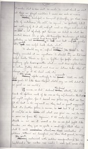
Figure 11: Page 170 from Stephen Crane's manuscript. Here, we can see the "raw" side of Crane's frantic edition process. From Fredson Bowers' facsimilie production of The Red Badge of Courage.
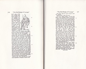
Figure 12: The New York Press edition, represented by Joseph Katz' facsimile Note the condensed type and abrupt ending.
A matter of sources: How The Red Badge of Courage exists in more forms than you'd think
Despite Crane living much like a mayfly, he produced multiple versions and revisions of his famous novel. Primarily scholars tend to focus on the following: a complete handwritten manuscript, a handwritten draft, a “press” edition of the story, and finally the novelized form, otherwise known as the “Appleton” text, after the first company to publish it.
First out the gate: The Press Edition
Though not chronologically first, the press edition (Figure 12) was the first version of The Red Badge of Courage the public got a hold of, and the version that arguably won Crane the lion’s share of his fame. Part of this was dependent on Irving Bacheller, who "formed the New York Press Syndicate" (Katz 24): Crane took the manuscript to him after several unsuccessful previous attempts at publishing. Bacheller supplied many of newspaper stories through his syndicate: and he ensured that The Red Badge of Courage was widely circulated to over "750 newspapers" (26), garnering massive immediate success. However, because this edition was serialised, a great deal of content had to be cut down, condensed or outright deleted in order to keep the magazines happy. To this effect, the Press edition represents perhaps the least complete of all of the versions: in Crane's own words it was "much worse that its original form" (31). Possessing an anaemic sixteen chapters to the Appleton edition’s twenty-four, it ends far sooner in the narrative, and with little restatement of the overall metaphors and motifs seen in the novel. At the conclusion, a comrade tells Fleming that a colonel has noticed his bravery. Half-scoffing, the press editions ends partway through this conversation, stating “They were very happy” (Katz 117), carrying little of the overall themes of later editions.
A Novel Concept: The Appleton Edition
The most well-known version is arguably the Appleton edition: as this was the first time that the narrative existed outside of a magazine, the story could be read straight through at once, without having to hunt down multiple issues of a magazine. The time between this Appleton edition and the press appearance also gave time for Crane to edit and expand upon both his manuscript and the Press edition. As a result, the Appleton edition is notably more fleshed out and cohesive than the press edition. For example, this edition contains, Homer-like, the continual epithet of the sun reoccurring throughout; whether it is “pasted in the sky like a wafer” (Pizer 50) or “bright and gay in the blue, enameled sky” (82) or, ultimately, “a golden ray” (109). By making this motif more present, Crane changes significantly the role of nature in the book and the lessons that it is meant to impart. By adding a final conflict in the additional chapters wherein, significantly, Fleming witnesses a “rival colour bearer… bitten vitally by… bullets” (104). With this Crane adds a final shock of war: one that transforms the narrative’s ending from a plaintive note about the futility of war, to a rumination on peace with “[Fleming] turned now with a lover’s thirst to… [a] soft and eternal peace” (109), having purged his heart of its bloodshed.
Authorial Intent: The Problem of the Manuscript
So why isn’t the Appleton edition simply considered the most authoritative? Much of this view has to do with the discovery of a draft manuscript, within which we discover lots of exciting insights into Crane’s edition and deletion process. For reference, look to the included Figure 11: Crane clearly intended to, at an earlier point, keep the names of the characters overt in the text. Later, it seems, he decided that the novel would be better if the characters assumed more general roles, perhaps as “everyman” characters that the audience could better identify with. So Fleming becomes “the youth” and Wilson becomes “the friend” (Bowers 155). And while the novel was well known for its portrayals of dialect and naturalistic speech, in this earlier version this persisted throughout, rather than just in spoken dialogue. Crane substitutes these for clearer, more standardised English: “he’d a knowed” becomes “he would have known that” and Fleming’s remark “well, we both done good” becomes “well, we both did good” (ibid). The manuscript, therefore, arguably presents a rawer form of the novel, one more naturalistic and colourful and full of Crane’s original intent. If nothing else, having a manuscript form of the novel gives us access to the concessions that Crane had to make, as well as the thought process; albeit, in a smudged, handwritten form, behind the conception of his novel.
That said, the issue then comes down to what edition to prioritise. Who can say what Crane truly intended for the story? Realistically, without the author present, there is simply no way to know: however, these decisions are still made behind the scenes in many editions of The Red Badge of Courage, at the behest of those rarely recognised in the realm of authorship. I talk, of course, about editors.
How editors wield more power than you think, and how they shape The Red Badge of Courage
While the civil war battlefield featured throughout The Red Badge of Courage has its share of violence, it would have to be truly titanic in order to rival the aggression of editors over Crane’s authorial intent. Given Crane’s relatively short time on this earth, very little remains in terms of written record of his true authorial intent. This has given spark to a powder keg of war between editors throughout The Red Badge of Courage’s history over what version they could possibly present to satisfy Crane’s true intent. Even today editors vigorously pursue new approaches.
Edit War
To give an idea of just how much editors disagree, I’ll sample from two editions. The first simply calls itself The Red Badge of Courage by Henry Binder, and the other braggadociously calls itself The Red Badge of Courage: An Authoritative Text. In terms of textual purity, the fact that the 'Authoritative text' is edited by four separate people should give even the most bull-headed of critics pause.
Given what we have already seen: that Crane continued to alter and change the manuscript over the years, we should be overjoyed that Pizer considers the manuscript “A great boon to Crane scholarship” (Bradley et al. 3), and then immediately disappointed in his further statement that “doubt [exists on] whether they should lead to any major revision” (3). Bredley et al., even in their definitive edition take great pains to de-emphasize and reduce the importance of the manuscript. In their minds, because the Appleton text “[has been] offered as a “reading” text” (3) for so long, by virtue of Grandfather clause it must be the definitive way The Red Badge of Courage should be experienced. Bradley et al. show this in several ways. Firstly, just like the two examples provided by University of Victoria special collections, the text is the Appleton edition, nearly unchanged. Further, as they do at least acknowledge that the manuscript edition exists, the uncancelled passages, including Chapter Twelve are included: outside of the narrative, in a small additional section deliberately separate from what they see as the "main text." By excising it from the narrative, they send a clear message to the reader to disregard this material as mere interesting ephemera. Indeed, in this passage they state outright that "this material clearly has no place in the text" (112).
Launching a ReBindal
Naturally, such a conservative approach has its fair share of detractors. Binder, in creating his 1979 edition three years later, takes an entirely different approach. To Binder, the Appleton text does not represent Crane’s original intent, but rather was not what ‘Crane conceived the story to be’ (111). He shows this in the primacy he gives the manuscript in this edition: Chapter Twelve is re-added into the narrative, now flowing naturally with the text. The final words present in the Appleton edition: ‘a golden ray of sun came through the hosts of leaden rain clouds’ (Pizer 109) are absent, as Crane put The End after them in the manuscript; they appear to have been added later by Appleton in order to bring a sense of unity to the text. Taking such an avant-garde approach to edition; and crucially, wearing your editorial stance on your sleeve, is very uncommon in even Crane scholarship, let alone scholarship in general. Binder, in his ‘Statement of Editorial Policy’, justifies his considerations for his version of the novel, for example, in leaving in the representation of dialect, given that Crane “abandoned the task… [and] revised inconsistently” (161). Editors rarely show this side of the process, but in acknowledging this rift, Binder creates a dialogue and shows, rather than hides, the highs and lows of Crane’s vision as it was created.
Neither of the Special Collections text could mention the manuscript, as it was not discovered at their time of publication, but they still enshrine an altered version of the text: one critically different from Crane’s original intent. And with “Authoritative” version, surrounded in essays and critical review in order to give a sense of gravitas and authority (over two-thirds of the “Authoritative” version is dedicated to these essays), it seems that the intent of the editorial canon is to preserve the Appleton text in some way at least. But Binder, Bowers and others represent a growing movement of editors who question the canon, and who recognise the manuscript’s power. While with The Red Badge of Courage this battle continues in the open, with arguments back and forth between warring sides, think of how many other texts go on without this record. With decisions being made in the dark about what the public finally receives, and what is thought of as the definitive version of the text afterwards. With so much editing of the text going on; with versions in various states of completion being remixed, re-edited and revised into different versions, can we say, without a nagging but, that Crane is the sole “author” of these versions?
Works Cited
"About Us." Peter Pauper Press, 2016, www.peterpauper.com/aboutus.php
Chikanobu, Toyohara. Illustration of Singing by the Plum Garden. 1887. Museum of Fine Arts, Boston.
"Company History." Peter Pauper Press, 2016.
Crane, Stephen. The Red Badge of Courage. Ed. Fredson Bowers, 1972.
Crane, Stephen. "The red badge of courage". A facsimile reproduction of the New York press appearance of December 9, 1894, with an introd. and textual notes by Joseph Katz. Florida, 1964.
Crane, Stephen. The Red Badge of Courage: An Authoritative Text, Backgrounds and Sources, Criticism Second Edition. Edited by Sculley Bradley, Richmond Croom Beatty, E. Hudson Long. Revised by Donald Pizer, W. W. Norton & Company, Inc., 1976.
Crane, Stephen. The Red Badge of Courage: an episode of the American Civil War. Edited by Henry Binder, W. W. Norton & Company, Inc., 1982.
Crane, Stephen. The Red Badge of Courage. Illustrated by Aldren A. Watson, Peter Pauper Press, 1954.
Crane, Stephen. The Red Badge of Courage. London: Heinemann, 1896.
Jackson, Anna. “Imagining Japan: The Victorian Perception and Acquisition of Japanese Culture.” Journal of Design History, vol. 5, no. 4, 1992, pp. 245–256.
Sorrentino, Paul. Stephen Crane. A Life of Fire. Boston: Harvard University Press, 2014.
"Publishers of To-Day: Mr William Heinemann." The Publishers' Circular and Booksellers' Record of British and Foreign Literature, vol. 62, 1895, pp. 49-51.
"Measuring Worth - UK Table Overview." Measuring Worth, 09 December 2016.
"Biography." Aldren A. Watson, November 2014,
"Home" Aldren A. Watson, November 2014.
"拓." wwwjdic, 11 December 2016 http://www.edrdg.org/cgi-bin/wwwjdic/wwwjdic?1E
JF/Fall2016
