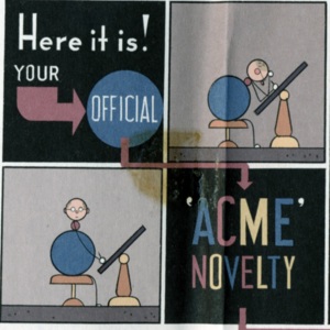
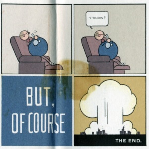
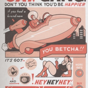
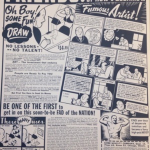
Chris Ware, The ACME Novelty Library: Final Report to Shareholders and Saturday Afternoon Rainy Day Fun Book (2005)

Fig. 1.0: click here to view banner metadata
Table of Contents
I . . . . . . . . . Introduction and Methodology
II . . . . . . . . Material Parameters
III . . . . . . . . A Note to Collectors
IV . . . . . . . . Contexts
V . . . . . . . . A Look Inside
VI . . . . . . . . Networks
VII . . . . . . . About Chris Ware
VIII . . . . . . Glossary of Terms
IX . . . . . . . . Bibliography
"Organized chronologically for your convenience, though in no way intended to be read in order, the contents of this book should be consulted only occasionally, as one would consume an assortment of individual cordials or swallow a daily dose of medicine."
(Ware, The ACME Novelty Library: Final Report to Shareholders and Saturday Afternoon Rainy Day Fun Book, 19)
I. Introduction and Methodology
"FANS OF LITERATURE, POETRY, and ART -
not to mention MUSIC, THEATRE, CINEMA, GASTRONOMY, and PUPPETRY
WILL BE GRAVELY DISAPPOINTED BY THE CONTENTS OF THIS VOLUME"
(Ware, The ACME Novelty Library: Final Report to Shareholders and Saturday Afternoon Rainy Day Fun Book, coverslip)
An introduction to Chris Ware's The ACME Novelty Library: Final Report to Shareholders and Saturday Afternoon Rainy Day Fun Book (henceforth referred to as The ACME Report) is an introduction to meticulous graphic design, striking colour palettes, sardonic wit, and a hefty sense of irony. A collection of content from volumes 7 and 15 of his serial The ACME Novelty Library, The ACME Report visually codes itself as an art object, yet its content directly undercuts any such reverence of it. Indeed, the summary presented on the University of Victoria Library website highlights the book’s preoccupation with its representation of itself as unremarkable, even useless:
Sometimes claimed to be his "best work" by those who really don't know any better, this definitive congestion of stories of the future, the old west, and even of modern life nonetheless tries to stay interesting by including a luminescent map of the heavens, a chart of the general structure of the universe, assorted cut-out activitites, and a complete history of The ACME Novelty Company itself, decorated by rare photographs, early business ventures, not to mention the smallest example of a Comic Strip ever before offered to the general public. All in all, it will likely prove a rather mild disappointment, but at least it catches the light in a nice way and may force a smile here and there before being shelved for the next generation's ultimate disregard and/or disposal.” (ACME: our annual report)
All 108 pages of The ACME Report, despite frequently insinuating their irrelevance, shortcomings, lack of wit, and poor humour, are striking: the volume is a collection of material from Ware’s previously published comic strips, punctuated with false advertisements, a fictional history of The ACME Novelty Company, a guide to identifying collectors, and activity pages. In Chris Ware, a book about Ware’s artistic process and major works, Daniel Raeburn remarks that comics are “composed not only of the intersection of words and pictures but also of words that act like pictures and pictures that act like words, with colour and composition shaping the map with their own structure and emotional meaning. This requires Ware to be not only a writer, drawer and painter – an illustrator, if you must – but a calligrapher, typographer and, to tie the arts all together, a graphic designer” (21). Indeed, Ware’s prowess as a writer and graphic artist are evident from a first glance inside The ACME Report: Ware’s style is simple yet intricate, and every inch on the volume suggests careful attention to detail. In combination with Ware’s “intellect and relentless curiosity about the form [of comics]” (Raeburn 11), such attention to detail suggests that Ware’s creations are far from useless or unremarkable, creating the irony that is responsible for both the humour and depth of Ware’s work.
The ACME Report is crowded with detail, and flipping through its pages can at times seem overwhelming: there is almost the feeling that no amount of time will be enough to absorb the content of the volume. The ACME Novelty Library began publication as a comic book series in 1993 and features multiple different storylines, including that of Jimmy Corrigan, the Smartest Kid on Earth, which would be published in 2001 as a stand-alone text, and go on to become one of Ware’s most notable creations. As a collection of previously published materials from storylines such as Big Tex, Tales of Tomorrow, Rusty Brown, and Quimby the Mouse, The ACME Report does not necessitate being read in order: although some pages are continuations of earlier material, they are able to stand on their own, thus making The ACME Report a volume that can be picked up from any page, supporting its title as a “Fun Book”, or book of activities and non-sequiturs for “Rainy Day[s]”. In terms of title, The ACME Report’s full title is listed as The ACME Novelty Library Our Annual Report to Shareholders and Rainy Day Saturday Afternoon Fun Book on the front of the paper coverslip that wraps around the volume, but its publication details that are listed on page 68 declare its title to be The ACME Novelty Library: Final Report to Shareholders and Saturday Afternoon Rainy Day Fun Book. For this exhibit, the latter title is used, although abbreviated to The ACME Report.
ON THIS EXHIBIT
Due to its fairly recent publication in 2005, The ACME Report is still in copyright, with the rights being held by Chris Ware. The effect of this on the exhibit is that only ten percent of its material can be reproduced: thus, the visuals on this page cannot accurately give a picture of the entirety of the volume. Each page of this volume is its own unique creation and could be analyzed individually for colour use, mise-en-page or layout, typography, and frame content. Furthermore, the inclusion of several different kinds of images opens the door to the potential analysis of how Ware uses different visual codes and layouts to convey different kinds of content. In translating The ACME Report to a digital platform, this exhibit focuses on pages that are more suggestive of the volume’s materiality and existence as a physical object. Moreover, it is important to note that the digital reproductions of pages from this volume do not convey the content in the same way as the physical object: the complexity and size of the pages cannot be taken in by the viewer as a whole. The images in this exhibit must be enlarged in order to better view their content, visual codes, typography, and diagrams, yet the enlargement of the images precludes the viewing of the page as a whole. The ability to do both is an essential feature of the structure of comics.
In reference to the previous vein of thought, this exhibit also explores the ways in which comics, with a specific focus on The ACME Report, resist digitization. Of course, there is some irony in digitizing an object that resists digitization, but it seems fitting for a text that celebrates irony and the ways in which form and content can either complement or oppose each other. In similar congruence to the volume, this exhibit does not need to be read chronologically but can be perused at the discretion of the viewer.
A note about text style and colours: large red typeface denotes quotations from The ACME Report, although quotations are occasionally worked into the paragraphs and clearly marked. Words and names that have been bolded (like this) can be found in the glossary near the end of the exhibit.
A final note: Because comis are a very visual medium and work through interconnections (and intraconnections), this exhibit features images from a variety of different sources all housed in Special Collections at the University of Victoria. Not only does this implicate the theme of networks, but the inclusion of multiple images from multiple sources is also a way of navigating copyright constraints (while giving full credit to the rights holders) and making the page as visual appealing as possible - just like a comic.
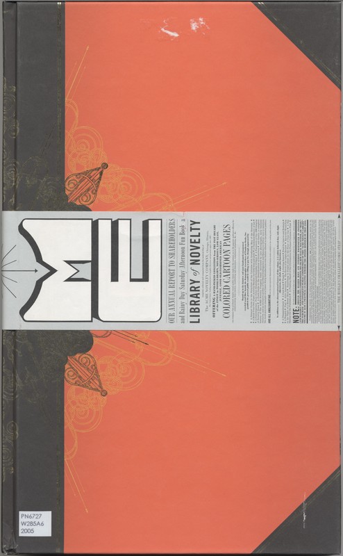
Fig. 1.1: Front Cover of The ACME Novelty Library: Our Annual Report to Shareholders and Rainy Day Saturday Afternoon Fun Book [2005]
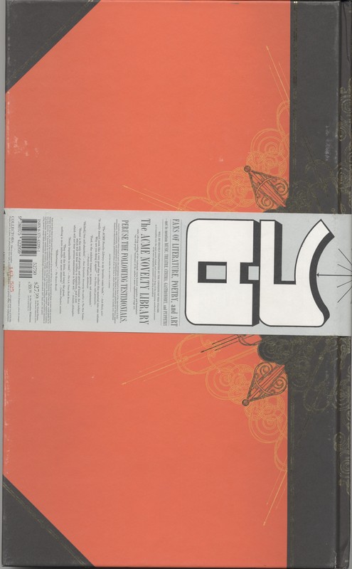
Fig. 1.2: Back cover of The ACME Novelty Library: Our Annual Report to Shareholders and Rainy Day Saturday Afternoon Fun Book [2005]
II. Material Parameters
"Bound up in the daintiest and most handsomely-ornamented recycled wood fiber boards the demographic researchers of Pantheon Books, Inc. gambled the general public would be willing to pay for"
(Ware, The ACME Report, coverslip)
In Between Pen and Pixel, Aaron Kashtan asserts that “the physical form of a comic is not culturally neutral. When comics are repackaged in different print or digital formats, this repackaging affects the cultural and economic status of these texts” (25). Indeed, the physical form of any text is not particularly neutral in any sense because of how materiality influences and shapes a reader’s interactions with and receptions to a specific work. Extrapolating this vein of thought, Kashtan argues that the materiality of comics is integral to their content, reception, and study, even more so than that of so-termed “literary works”, contending that the reprinting of the latter “on new paper or with a different typeface […] is not typically seen as an alteration of the essential nature of the text” (26). In contrast, altering such aspects of typeface, paper weight, or physical dimensions in a comic can dramatically alter or restructure its content because “comics don’t have a pre-existing meaning that is prior to material parameters like lettering, publication design, or methods of distribution. Rather, the meaning of comics is created by these material parameters” (Kashtan 27, emphasis in original).
The same idea is articulated in more general terms by textual scholar Jerome McGann insofar as literary texts feature a type of “self-attention [viewed] as the inseparability of the medium and the message, the advent of meaning as a material event which is coterminous (in several senses) with its textual execution” (11). McGann continues to assert that “[l]iterary works do not know themselves, and cannot be known, apart from their specific material modes of existence/resistance” (emphasis in original, 11). This is directly echoed by Kashtan’s assertion that meaning in comics is a direct product of their materiality. Furthermore, McGann asserts that “all texts, like all other things human, are embodied phenomena, and the body of the text is not exclusively linguistic” (13). Such an assertion is particularly applicable to comics insofar as their entire medium is “not exclusively linguistic”, but operative on the combination of language and images: moreover, the medium is heavily defined by the circulation of material, thus demanding increased attention to what is described by McGann as “typefaces, bindings, book prices, page format, and all those textual phenomena usually regarded as (at best) peripheral to ‘poetry’ or ‘the text as such’” (13), with “poetry” and “the text as such” referring to the immaterial content of a written work.
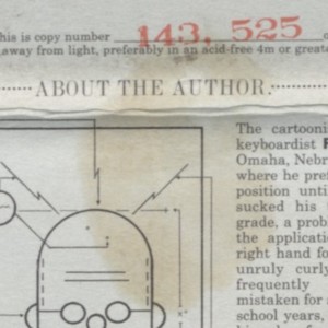
The material parameters of Chris Ware’s The ACME Report are nothing less than striking: at 39cm tall by 24cm wide, with a bright red cover decorated with ornate gold designs emanating from the spine, The ACME Report draws attention to itself as a material work from a first glance. Wrapped around the cover is a 9cm tall paper wrap with the work’s title, content descriptions and disclaimers, satirical publication details, note to collectors, and author biography. The note to collectors on this particular copy of The ACME Report identifies it as copy 143, 525 of a press run of 875, 000, also suggesting that the collector store this volume in a “clean, dry place, away from light, preferably in an acid-free 4m or greater mylar, with backing board”. The suggestion to collectors is obsolete, as hardcover books do not need to be bagged in Mylar nor stored with a backing board: thus Ware mocks the culture of comic collecting and fastidious preservation of books in their original condition (Cheng 98).
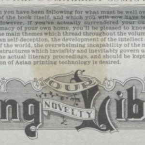
The paper wrap not only offers suggestions to collectors, but presents alternate uses for the physical object of The ACME Report, stating that with only “slight adjustment, the whole might also function as [among other things]: a disappointment, a used book, trash, a cutting board, food for insects and rodents, a weapon, fuel, […] recycled wood pulp in the paper of a better book, […and] a puzzling shard of our civilization for future cultures to find”. The self-deprecating tone present in the cover wrapping not draws attention to the materiality of the physical book, but situates it within a lifecycle: it can decay, be destroyed, repurposed, and discarded. There is evidence of such wear-and-tear on this particular volume, with both a tear and stain on the paper wrapping, peeled back paper on the cover, and some general foxing on the bottom of the spine. However, the appearance of The ACME Report seems to be at odds with the suggestions for its other uses: The ACME Report resembles an art object through its cover and binding (and even a brief flip-through of its pages), and this image is dissonant with being used as a cutting board or being repurposed into another book. This dissonance is part of the content of The ACME Report, but is effective only insofar as the material parameters of the volume oppose the disparaging descriptions of the volume’s other potential uses, illustrating how the content of The ACME Report (and the reader’s initial impression of it) is a direct product of the volume’s material properties. To alter the material parameters of this book thus would be to change its meaning: a less (or more) ornate cover, a different type of paper, different dimensions would either expand or collapse the dissonance. The specific tension between the image and the words of the cover of The ACME Report represent, in miniature, not only the tension that Ware continuously evokes throughout this volume, but also illustrate one of the foundational ideas for how comics operate: in the most basic sense, reading a comic is being able to understand how images and words are working in conjunction (but not necessarily harmony) to produce meaning.
III. A Note to Collectors
The gallery below features close up images of the damage on copy 143, 525 of The ACME Report, housed in Special Collections at the University of Victoria. In general, this volume is in fair condition: the damage is only to the covers and the paper coverslip. Such foxing and presence of stains suggest prior use, but this volume does not by any standard seem to have been mistreated nor, as per humourous suggestion on the coverslip, used as “a cutting board, food for insects and rodents, a weapon, fuel."

Fig. 2.1: Cover of The Incredible Hulk #196 [Feb. 1976], a title approved by the Comics Code of Authority
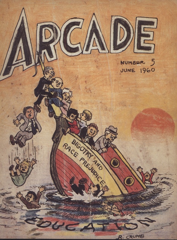
Fig. 2.2: Cover for Robert Crumb's Arcade No. 5, an alternative comics publication. Not approved by the Comics Code of Authority.
IV. Contexts
"All in all, it is sure to be great fun for everyone. Read carefully all fine print."
(Ware, The ACME Report, 64)
In his introduction to the book Critical Approaches to Comics, Henry Jenkins describes his exposure to comic books in his youth:
We read for no purpose other than pleasure – there was no method to tell us how we were supposed to read…We read in secret – under the covers by flashlight, hidden in a textbook in class – with the knowledge that there was something vaguely oppositional about our practices. You didn’t stand up in front of a classroom and do a book report on what you’d read, let alone frame a scholarly lecture or essay. (1)
What Jenkins touches on is the notion that comic books occupy (or have at least have once been thought of occupying) a space outside of the “literary”: this purported distinction is also suggested when Kashtan identifies the significance of materiality in comic books compared to "literary works". The problems with such binary opposition are many and multi-faceted, including (but not limited to): associating “the literary” with sophistication and intelligence and comics with simplicity, crudeness and pleasure, placing comics outside the consideration of “the literary”, and perhaps most nebulous of all, defining “the literary”. The strength of Jenkins’ anecdote lies in its evocation of the widely accepted notion that historically, comics were for children.
In the earlier publication, Reading Comics: Language, Culture, and the Concept of the Superhero in Comic Books, Mila Bongco offers an overview of critical attention to comic books, identifying an “association of comics primarily with children, adolescents, and the sub-literate […through] the profusion of books, articles, reviews, and outright attacks on comics that characterised its body of critical studies for the longest time” (1-2). Although Bongco also asserts that the mass production of comics was integral to their novelty, such “[t]raditional criticism about comics reflects the pattern of ambivalence and censorious attitude toward mass media in general” (2). Moreover, “[t]he rise of comicbook production [in the 1940s and 1950s] coincided with a time of extraordinary attention to juvenile delinquency” (Bongco 2), the supposed link between the two being expressed in Fredric Wertham’s 1954 polemic book Seduction of the Innocent (Bongco 2). The effects of Wertham’s writing were widespread, leading to the development within the comics industry of the Comics Code of Authority which acted to censor unsavoury content, thus impinging on the “creative freedom” of comic books and leading to the publication and circulation of comic books that “tended toward the representation of oversimplified conflicts […and] were trapped in the trifling problems and conflicts in a universe of costumed superheroes or ‘funny’ talking animals” (Bongco 4). However, the Comics Code also led to the development of alternative comics, which “increasingly went beyond the thematic and narrative possibilities approved by the Code […and] cultivated an outlaw image […] deliberately aimed to offend the sensibilities of bourgeois America” (Bongco 5-6). Such alternative comics (often referred to as ‘commix’ to differentiate themselves) are loosely defined by their “distinction from a perceived mainstream of superheroes, formulaic sci-fi or fantasy, and children’s humour” and were largely “self-published or produced by small independent publishers” (Tinker 1170). Alternative comics were produced on a much smaller scale than their popular counterparts, with underground artists such as Robert Crumb, a prominent artist in the medium, “appropriate[ing] a textual shape who associations [with mass production and popular consumption] were ripe for subversion” (Tinker 1170). As such, alternative comics were intensely invested in their material parameters: in the words of Emma Tinker, “the physical product – the size, shape and feel of ink on cheap, folded paper – played a crucial role in the reception of alternative comics. Equally significant was the way in which the products of these artists were marketed and distributed” (1170). The rise in the production of alternative comics contributed to what Tinker terms the “adulthood” of comics, also brought about through the “gradual relaxing of the criteria by which ‘culture’ was generally defined” during the 1980s and 1990s (Tinker 1171).
In terms of fitting Ware into the framework of alternative comics, Daniel Raeburn says it best: “[a]long with Daniel Clowes, Robert Crumb, and the Hernandez brothers, Ware is a luminary among cartoonists of the so-called underground, adult, alternative or art persuasion. His irregular comics pamphlet, The Acme Novelty Library, is a smash hit by the subculture’s standards, selling an average of 20,000 copies per quasi-annual issue and earning him every award a cartoonist can win: Eisner, Ignatz, Harvey and Rueben” (9). Not only is Ware a well-known and celebrated writer in the alternative milieu, he has achieved success on a mainstream level which is reflected in the physicality of his publications. Ware’s ability to publish “very elaborate texts in unconventional formats” is due to the fact that his work is popularly consumed (Tinker 1173). The physical parameters of The ACME Report are arguably opposite to the black and white graphics and “cheap, folded paper” of earlier alternative comics, yet its content is deeply complex and subversive. Indeed, its material format is not congruent with many comics on both the popular and alternative markets (although in recent years, the markets have converged): its heavy paper weight, hardcover binding, gold ornamentation, and folio size are standout features. Unlike smaller, thinner, cheaply produced comic serials, this volume cannot be folded up and carried around in a back pocket, nor does it suggest mass production and rapid circulation. Instead, there is the suggestion of value in terms of both art object and capital.
LOOKING FORWARD (and LOOKING IN)
In Comics, Materiality, and the Future of the Book, Kashtan asserts that “[i]f we want to know how the reading experience will be transformed by changes in material context, we need to be looking at comics” (11). Indeed, Kashtan’s book explores the ways that comics “make the act of reading visible” and bring a heightened attention to ways in which reading experience is linked to materiality (17): in his words, “every comic looks visually distinct from every other comics, whereas one prose novel or academic monograph looks much like any other prose novel or academic monograph, and this means that materiality tends to be far more noticeable in comics than in prose” (15). For the textual scholar, this assertion may be a little reductive, yet the idea that Kashtan is gesturing to is not the notion that the materiality of prose novels deserves less attention, but that the ways in which material changes influence a text “are more immediately obvious” in comics (15).
In the current comics industry, readers value the unique properties of both print and digital, and this has resulted in an environment where print and digital modes of delivery have worked to support rather than replace each other. It has become increasingly common for comics to exist in both print and digital forms at once. Most commercially published print comics are now also published in digital form, with notable exceptions such as Fantagraphics and Drawn & Quaterly, and many works that start out as webcomics are ultimately printed […] Comics can be re-flowed, and a significant number of them are. (Kashtan 93)
The above quotation illustrates that comics are not a medium that cannot be digitally translated or remediated: indeed, many of them are. However, because of their more explicit materiality, there can be a more explicit discourse of how the translation of a material object to a digital platform can affect its content, reception, distribution, and relevance. Ware’s The ACME Report is, however, a “notable exception”. Aspects of the volume prove either difficult to translate to a digital platform or impossible: the glow-in-the-dark aspect of the astrological map featured on page 4 and 5 of The ACME Report cannot be experienced through a digital platform. Likewise, though the comic under the paper coverslip can be scanned, there is no opportunity for the viewer or reader to experience the “unwrapping” of the text. However, the largest challenge in digitizing The ACME Report lies in the complexity and size of its pages: the size of the pages in The ACME Report may not translate well to the size of the screens a digital version of it is displayed on, a difficulty that Kashtan notes about the process of digitizing comics in general (113). The effect of this is that digital pages of The ACME Report (as displayed on this page) are only able to be viewed in sections: although the full images are displayed on this page alongside the text, their complexity can only be viewed in a close-up version. When viewed in detail, the experience of the entire page is lost. This causes as dislocation of meaning, as “[o]ne of the fundamental design elements of nearly every print comic is the page” (Kashtan 113). Although “the page as a compositional unit is not identical to the page as a physical object […] in almost all print comics, each page (in the compositional sense) corresponds in size and shape to each page (in the physical sense) and can be seen in its entirety all at once” (Kashtan 114). The ability to view all the complexities of a page all at once is one of the ways the comics medium differs from prose in its presentation of narrative as the reader is able to view multiple storylines simultaneously. The reader is not required to read the page linearly in order to be aware of its content, although often there is an implicit order in which to read the panels. However, considering the importance of mise-en-page in comic book design, to only have access to pages in fragments on a digital platform is to alter the overall effect of the text. For the digital remediation of The ACME Report, this is especially evident: the size, illustrative detail, and miniature typeface of each page cannot in their entirety be adequately translated onto this platform.
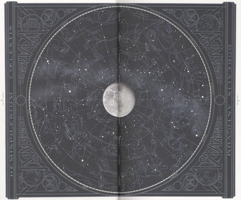
Fig. 2.3: Pages 4 and 5 of The ACME Report [2005], a fictional glow-in-the-dark astrological chart.

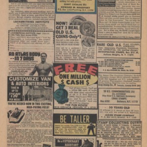
Fig. 2.4: Page 69 of The ACME Report [2005], joke advertisements.
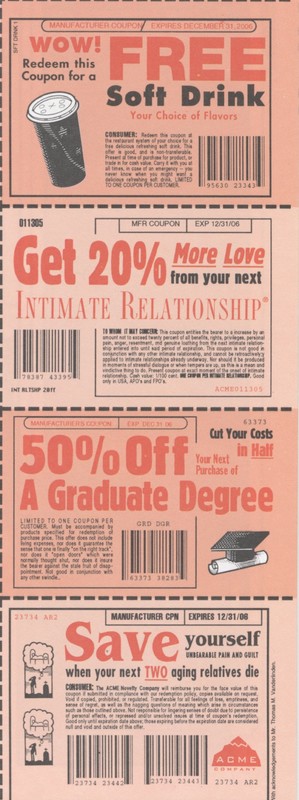
Fig. 2.5: Details of advertisements from page 69 of The ACME Report [2005]
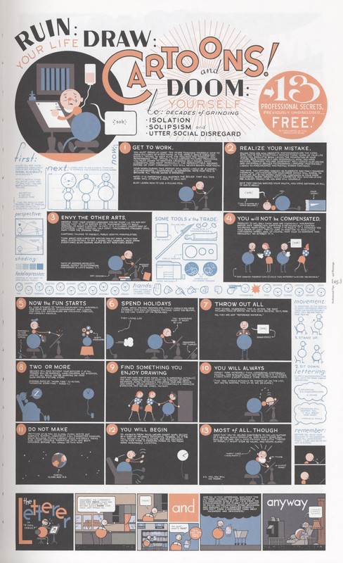
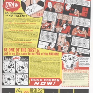
Fig. 2.6: Page 25 of The ACME Report [2005], an instructional guide to ruining your life by learning how to draw cartoons.
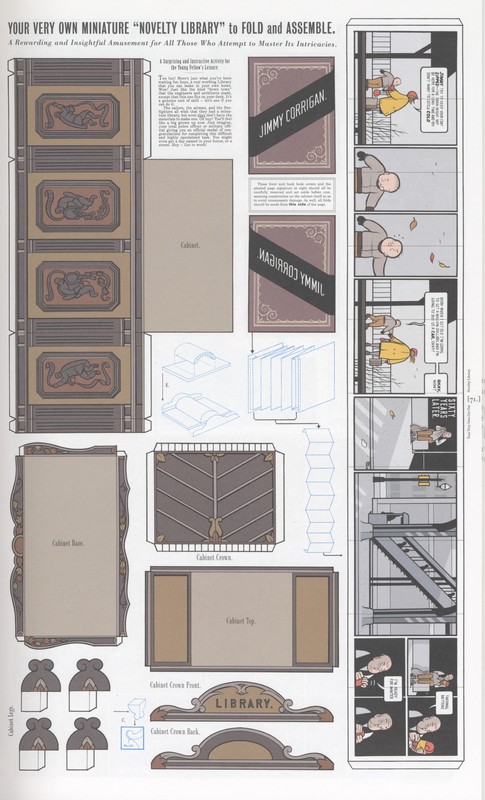
Fig. 2.7: Page 71 of The ACME Report [2005], Build Your Own ACME Novelty Library
V. A Look Inside
"Offering a hand-picked congestion from the past decade of the finest in poorly-drawn, non-serious, low class, juvenile, good old-fashioned American colored cartoon pages"
(Ware, The ACME Report, coverslip)
MAP OF THE HEAVENS (Fig. 2.3)
Pages 4 and 5 of The ACME Report feature a spread of a fictional glow-in-the-dark astrological map, titled “Hemisphærium Cœlestis/ Borealis Antiqvum”. Ware’s illustrations of real constellations such as Leo, Cancer, and Ursa Major are visible in blue ink, the more clearly observed constellations when the text is under electric or natural light. Upon moving into a dark room or turning off the lights, the glow in the dark images are made available, including such fictitious constellations as “A Hospital Bed”, “The Latest Model”, and “The Collectibles”. This spread comes after a few unnumbered pages of satirical advertisements, acting as a visual cue signifying a transition into the more “serious” or “plot-related” content of the volume, a reworking of conventional comic book norms which would feature a full-page illustration or title page introducing the contents of a particular issue (provide an example of this from somewhere else). In terms of the materiality of The ACME Report, these pages demand physical interaction.
A Personal Note: within the parameters of Special Collections, I found myself either having to move into a dark classroom with the book or quickly cup my hands around a particular constellation and look into them in order to experience the glow-in-the-dark details. Moreover, in digital translation of this page, such physical experience as described above is lost: the glow-in-the-dark content cannot be transferred through a scanned image.
ADVERTISEMENTS (Fig. 2.4 and 2.5)
A total of twelve pages of The ACME Report are dedicated to false advertisements, offering anything from Christmas cards to “Success”-flavoured cocaine, x-ray goggles to a “Citadel of Dreams”. The visual language of these pages evokes newspaper classifieds and the advertisements for mail-order items which were a characteristic of earlier, mass-produced comics. There is evidence in these pages of Kashtan’s assertion that the materiality of comics directly influences their meaning: the collections of blurbs selling “Irony”, “Childhood”, “Placebo Birth Control”, and all manner of items function as a critique of newspaper classifieds and consumer culture through their appropriation of the visual language of newspapers and advertisements. Also present in these pages are several mock coupons, offering such things as “50% Off a Graduate Degree” and “20% More Love from your next Intimate Relationship”, and surrounded by broken-line borders, suggesting that they should be cut out. The irony that is produced is a result of the tension between the physical object and its written content: although visually signified to be cut out, doing so would destroy the content on the reverse side of the page. Moreover, the paper weight is not reminiscent of the thin, cheaply produced newspapers or fliers, but rather heavy cardstock. For an example of advertisements produced in popular comic books on thin, cheap paper, refer to the below gallery, with advertisement pages from Marvel's The Incredible Hulk.
INSTRUCTIONAL GUIDE (Fig. 2.6)
Page 25 of The ACME Report features a guide to ruining your life by learning how to draw cartoons. Again, the visual language and layout of this page work to produce meaning on this particular page. The typography for “Cartoons!” is bold and colourful, drawing the focus of the reader to it and not so much to the surrounding mention of “ruin” and “doom”. There is a small round bubble proclaiming “13 Professional Secrets, previously undisclosed…FREE! To purchasers of this hardcover book”: the larger size of “free” not only draws attention away from the fine print disclaimer, but is reminiscent of promotional content or advertisements designed to catch reader attention. In terms of typography, Raeburn asserts that Ware uses “typography to tell not only the verbal story but also the visual story […as] a way for him to fit more expression, and therefore more emotion, into his comics” (19). Thus, the different styles of typography Ware uses are all intentional and aimed at producing a certain effect (and affect): in Ware’s own words, “I’ve tried to teach myself enough about typography so that when I write a word or use a typeface […it] reflects exactly the feeling that I’m going for […] In the same way that when you’re writing you search for the right adjective and it comes up and feels just right – I want to do that with my type” (qtd. in Raeburn 19).
FOLD AND ASSEMBLE: MINIATURE ACME LIBRARY (Fig. 2.7)
Page 71 of The ACME Report features what is titled “Your Very Own Miniature ‘Novelty Library’ to Fold and Assemble”. The illustrations on this page are visually coded to suggest an activity page: each illustration is labeled (ie, “cabinet”, “cabinet base”) and features white tabs on their edges that are intended to be folded and glued together. The illustrations in blue are diagrams of what the assembled object should look like, as well as visual instructions for how to put the object together. The reverse side of the page gives further instructions:
First of all, cut out all pieces along the heavy black lines printed on the opposite side of this page – the only cuts you will make from this side are when you cut out the puzzle pieces. Now, score along all fold lines using a dull kitchen or butter knife. All folds are ‘down.’ Fold both of the box inner sleeves and glue into shape. (a.) Then fold the outer sleeves, glue, and allow to dry. Once dry, you may mate these pieces together as shown. (Ware, The ACME Report, 72, emphasis in original)
Similarly to the advertisements, the suggestions to cut out pieces of these pages works against the material parameters of the text: the heavy paper weight and existence of these pages within an ornately bound volume do not necessarily encourage the desire to deface or alter the text. Moreover, Ware’s prevalent use of irony suggests that the instructions provided should be taken with a certain scepticism. In terms of materiality, however, these pages reference activity pages of earlier comics and manuals, and bring attention to the book as a physical object by suggesting the reader’s physical interaction with it. Digital remediation of the advertisements pages as well as this cut-out-activity page lead to a further distancing of the viewer from the material object: with the physical volume in hand, instructions to cut out pieces of the text are immediately possible (even if not actually intended), whereas the same instructions on a digital platform cannot be carried out in the same way. Even if the reader is not meant to actually cut out pieces of the text, the possibility that they can brings immediate attention to the way The ACME Report exists as an embodied object.
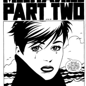
Fig. 3.2: Page 9 from Love and Rockets: Book Three [1987] by Gilbert and Jaime Hernandez. An example of alternative comics, housed in University of Victoria Special Collections.
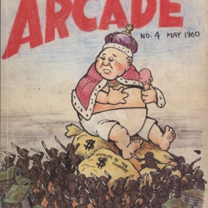
Fig. 3.3.: Page 88 of Vol. 1 of The Complete Crumb Comics [1987], featuring a cover image of Arcade No. 4 by Robert Crumb. An example of alternative comics, housed in University of Victoria Special Collections.
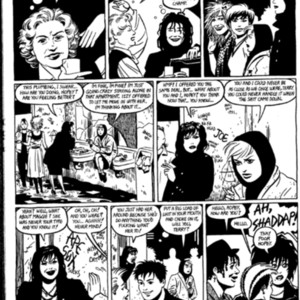
Fig. 3.4: Page 52 of Love and Rockets: Book Three [1987] by Gilbert and Jaime Hernandez. An example of mature content in alternative comics, housed in the University of Victoria Special Collections.
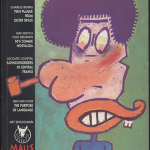
Fig. 3.5: Cover of RAW: Open Wounds from the Cutting Edge of Commix [1989], a collection of commix. Housed in the University of Victoria Special Collections.
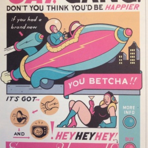
Fig. 3.6: Advertisement from Ware's The ACME Novelty Library Volume 15 [2001]. Content from this volume is entirely included in The ACME Report [2005].
VI. Networks
The very cover of The ACME Report suggests its place within a network, with the disclaimer that "fans of literature, poetry, and art - not to mention music, theatre, cinema, gastronomy, and puppetry - will be gravely disappointed by the contents of this volume" (coverslip). Although humourous, Ware's disclaimer aims to target many audiences, suggesting that its contents are applicable to, and made up of many different artistic (or otherwise) forms.
In his book, The System of Comics, widely recognized as one of the most important explorations of the comics medium, Thierry Groensteen argues that comics “can only be described in the terms of a system” (emphasis in original), defining them as “an original combination of a (or two, with writing) subject(s) of expression, and of a collection of codes” (6). The analysis of comics must always take into consideration the larger codes that influence the “component elements” within particular panels (Groensteen 6): “codes weave themselves inside a comics image in a specific fashion, which places the image in a narrative chain where the links are spread across space, in a situation of copresence” (7). If comics are approached as a collection or system of codes, they also evoke the idea of a network, for which the Oxford English Dictionary offers multiple definitions, including: “a chain or system of interconnected immaterial things” and “any netlike or complex system or collection of interrelated things, as topographical features, lines of transportation, or telecommunications routes” (“Network”). It is useful to reference both such definitions in order to analyze the particular networks pertaining to The ACME Report: as a comic, its content is a network in terms of being an interrelated system of words and images. To read a comic is to understand how words and images create meaning through their interrelation: a comic book is itself the very iteration of a network. Moreover, The ACME Report belongs to a wider network in the comic book genre based on how its images, typography, and written content reference, perform, and satirize comic book tropes, traditions, and particularities of the form. The ACME Report is itself a collection of comics that were published in previous issues of the longer running serial The ACME Novelty Library, drawing its content mainly from issues 7 and 15, with Ware also adding in multiple advertisement pages, activity pages, and an explanation of the fictional ACME Company. In a further exploration of networks, this copy of The ACME Report is also part of a network of texts housed in Special Collections at the University of Victoria: simply by way of its inclusion in Special Collections, it is linked to the other housed texts. Moreover, Ware belongs to a network of comics artists through comparison and criticism, as well as collaboration. Although not present in The ACME Report, The ACME Novelty Date Book: Volume One (also housed in Special Collections at the University of Victoria) features drawings from Charles Burns and Daniel Clowes, both artists of alternative comics.
ON THIS GALLERY
This gallery features examples of alternative comics that are housed in Special Collections at the University of Victoria, including work from Robert Crumb and the Hernandez brothers, all of whom are written about in conjunction with Chris Ware as being prominent names in the subculture (Raeburn 9). Although design styles differ immensely between these comic creators, they all belong to a network of alternative comics, and creators often borrow from or reference each other. In the fine print of an introductory page of Ware’s Quimby the Mouse, also housed in Special Collections, Ware declares, “[a]lso, note that a number of pages in this book show a decided similarity to other artists’ superior work, in some cases ending up as almost plagiaristic dilutions, viz: […] page 25, Robert Crumb; […] page 42, Charles Burns” (1). Additionally, images of early twentieth century comics by Windsor McCay have been included to showcase the tradition of numbering panels, as referenced at times in The ACME Report.
Also featured in this gallery is an image of RAW: Open Wounds from the Cutting Edge of Commix, an anthology of alternative comics. Also featured in this gallery is an image of RAW: Open Wounds from the Cutting Edge of Commix, an anthology of alternative comics. Edited by prominent comics creator Art Spiegelman, RAW was a magazine showcasing alternative comics, and also one of the first comics magazines to feature Chris Ware’s work (Raeburn 12). The issue of RAW featured in this gallery does not include Ware’s work, but is notable for being a long-running publication in the medium, as well as the publication associated with Ware’s beginnings. In The Comics of Chris Ware: Drawing is a Way of Thinking, the first anthology of critical analysis centred on Ware’s work, Martha B. Kuhlman and David M. Ball state that “[t]hrough RAW, Ware was exposed to the work of comics innovators such as Charles Burns, Gary Panter, […] and Spiegelman himself, all profound influences on his artistic outlook and career […] RAW demonstrated that conspicuously ‘difficult’ comics could be taken seriously and served as a formative introduction into alternative comics for Ware” (xii).
Also included in this gallery are images from other publications by Chris Ware that appear in slightly altered formats in The ACME Report. These images have been found in other texts by Chris Ware that are also found in Special Collections: Quimby the Mouse [2003], and The ACME Novelty Library: Annual Report to Stockholders, or, The Second Volume of Jokes [2001] (also known as The ACME Novelty Library Volume 15, and contents of which are entirely featured in The ACME Report).
As much as it is original, Ware’s work is in part a pastiche – yet the styles he imitates are both within the language of comics and extraneous to it. Ware borrows from art, music, architecture, literature, and other comics artists: this gallery is intended to showcase some pieces of these relations, as well as provide examples of the canon in which Ware exists.
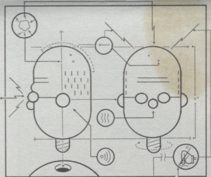
Fig. 4.0: Self Portrait of Chris Ware from the paper wrapping of The ACME Report [2005]. Top left corner featuring a stain.
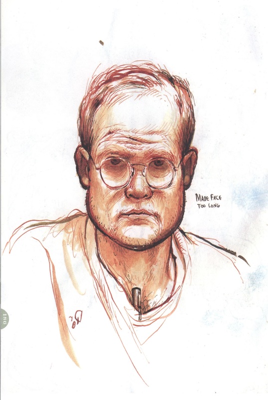
Fig. 4.1: Self Portrait of Chris Ware from The ACME Novelty Date Book: Volume One [2003]
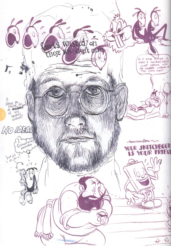
Fig. 4.2: Self Portrait of Chris Ware with other drawings, from The ACME Novelty Date Book: Volume One [2003]
VII. Drawing as a Way of Thinking: About Chris Ware
"Mr. Ware is six foot one and a half inches tall, roughly 175 lbs, and in peak physical condition. He is well-read, enjoys discussing literature, cinema, and women's issues, and is extraordinarily interested in the Dewey decimal system [...] He is listed in the local telephone directory and may be easily contacted by allowing the phone to ring three times, then hanging up and dialing again."
(Ware, The ACME Report, 68)
Franklin Christenson Ware was born on December 28th, 1967 in Omaha, Nebraska. He attended the University of Texas where he studied the fine arts. Although he began pursuing graduate school at the Art Institute of Chicago in 199, Ware did not finish these studies (Ball and Kuhlman xiii-xiv). Ware is a prolific cartoonist, with an “oeuvre [that] offers unique challenges to the literary critic, the art historian, and the comics theorist alike, providing a complex array of texts to interpret and consider” (Ball and Kuhlman xvi).
This array of texts includes: The ACME Novelty Library [1993-2008], Jimmy Corrigan: The Smartest Kid on Earth [2000], Quimby the Mouse [2003], The ACME Novelty Datebook [2003], The ACME Report [2005], The ACME Novelty Datebook, Volume Two [2007], Building Stories [2012], and Monograph [2017].
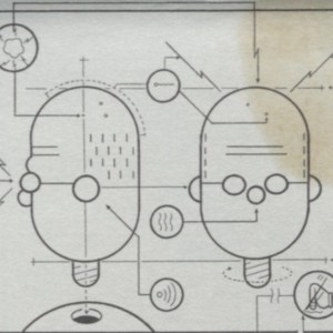
Ware collects and archives early twentieth century comics, such as those by Frank King and George Herriman, often citing their stylistic choices in his own comics (Raeburn 13). In addition to his work as a cartoonist, Ware is an “accomplished amateur musician”, playing both the piano and the banjo, and studying “turn-of-the-century American music as assiduously as he studies early comics” (Raeburn 23). Ware’s training in music transfers into his comics, as “[l]ike music, comics are composed of divided time. The gutters between panels mark these divisions and give comics what comedians call timing, actors call beats and musician call rhythm” (Raeburn 23). In terms of networks, not only do his comics operate on the interrelation of words and images, Ware is creating connections in his work through the citation of earlier comics, as well as creating connections to different mediums. Moreover, the very self-portrait Ware includes on the coverslip of The ACME Report is suggestive of networks: the portrait is a diagram that essentially assembles Ware’s face through a series of arrows and lines, making connections between different shapes to piece together a whole.
Because Ware is still living and a notable cartoonist, there are plenty of interviews addressing everything from his music exploits to his artistic process, his childhood to his thoughts on his cartoonist cohort, excerpts of some which are included here.
On artistic process (from 1994):
I don't see how anyone could sit down and try to think ahead of themselves. I would create the most boring stuff if I sat down and scripted things because the sort of associations that occur while you're drawing and the you get are the real ideas. I don't think it's possible to have a fundamental idea when you start out scripting or laying out a strip...I never know how any of my strips is going to end at all. (qtd. in "Chris Ware Interview" 28)
On what ACME means (from 1998):
I guess "Acme" has all sorts of connotations to me: obviously it seems to be from an earlier time when it was a common appellation to describe a business, and when the use of the "classical" reference didn't have any ironic aftertaste, as it does now [...] I started using it as a "fake title" because I suppose I thought it might be amusing, or something - I don't know - to hide behind this faceless non-entity, which I could then simultaneously celebrate and mock. Mainly, I didn't want my name plastered all over the covers and interior of my comic book. I wanted the name of my book to sound boring, inflated, cumbersome and to be easily forgotten. (qtd. in "Chris Ware of theAcme Novelty Library" 73)
On his style (from 2006):
I try to use the rules of typography to govern the way that I ‘draw,’ which keeps me at a sensible distance from the story as well as being a visual analog to the way we remember and conceptualize the world. I figured out this way of working by learning from and looking at artists I admired and who I thought came closest to getting at what seemed to me to be the ‘essence’ of comics, which is fundamentally a weird process of reading pictures, not just looking at them. I see the black outlines of cartoons as visual approximations of the way we remember general ideas, and I try to use naturalistic color underneath them to simultaneously suggest a perceptual experience […] Unfortunately, as a result, I guess sometimes readers get a chilled or antiseptic sensation from it, which is certainly not intentional (qtd. in “On Cartooning” 147).

Fig. 4.3: Glossary from page 66 of The ACME Report [2005]
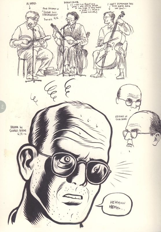
Fig. 4.4: Self-portrait by Charles Burns in Chris Ware's sketchbook, published in The ACME Novelty Datebook: Volume Two [2007].

Fig. 4.5: Self-portrait by Daniel Clowes in Chris Ware's sketchbook, published in The ACME Novelty Datebook: Volume Two [2007]
VIII. Glossary of Terms
Art Spiegelman: American cartoonist hugely influential in the underground/alternative comics milieu, and a contemporary and friend of Chris Ware. He is best known for his graphic novel Maus, about his father's experience as a Jew during the Holocaust. Along with his wife Francoise Mouly, Spiegelman is an editor of alternative comics magazine RAW. To view a digital copy of Maus hosted by the Internet Archive, click here. Information about copies of Spiegelman's work housed in Special Collections at the University of Victoria can be found here, here, and here.
Cartoons: As defined by the Oxford English Dictionary, "A full-page illustration in a paper or periodical; esp. applied to those in the comic papers relating to current events. Now, a humorous or topical drawing (of any size) in a newspaper, etc." ("Cartoon"). As defined by Scott McCloud, a "single panel [...] approach to picture-making" often with juxtaposed words and images (20-21). Cartoons are often defined by their singularity: McCloud's definition asserts that cartoons defined by not being a part of a sequence of image and text. However, this definition has room for movement, as creators of sequential art often call themselves cartoonists (ex. Chris Ware).
Charles Burns: An American cartoonist born in 1955 (pictured in Fig. 4.4), best known for his work in the magazine RAW, as well as his graphic novel Black Hole. A contemporary and friend of Chris Ware. To learn more about Burns and for examples of his art, click here.
Comics: As defined by Thierry Groensteen, "an original combination of a (or two, with writing) subject(s) of expression, and a collection of codes [...] it can only be described in terms of a system" (6). As defined by Scott McCloud, "juxtaposed pictoral and other images in a deliberate sequence, intended to convey information and/or produce an aesthetic response in the viewer." (20). Largely a loosely defined category, but generally involving the interaction between text and image in sequence.
Comics Code of Authority: A censorship standard placed on comics from within the industry: content that was disallowed included profanity, overt sexuality, extreme violence, reference to drugs and alcohol, among other "'overtly mature treatments of adult themes'" (qtd. in Bongco 4).
Commix: Alternative comics, often defined by their “distinction from a perceived mainstream of superheroes, formulaic sci-fi or fantasy, and children’s humour” and historically “self-published or produced by small independent publishers” (Tinker 1170). Largely a reaction to the censorship of the Comics Code of Authority, commix largely featured some of (but not limited to) the following: nudity, sexuality, drugs, existential dread, scathing political commentary, adult humour, sardonic humour, and vulgar language.
Daniel Clowes: An American cartoonist born in 1961 (pictured in Fig. 4.5), notable works include the comic book series Eightball and the graphic novels Ghost World, Wilson, and Patience. A contemporary and friend of Chris Ware.
Frank King: An American cartoonist born in 1883 and died 1969, creator of the comic strip Gasoline Alley. An influential cartoonist to Chris Ware, who has stated that Gasoline Alley "'changed a lot of [his] thinking about comics. It made [him] realize that the [...] emotion [of a comic] came from the way the story itself was structured." (Raeburn 13). To view some strips of Gasoline Alley that are in the public domain and housed by The Digital Comic Museum, click here.
George Herriman: Creator of the comic strip Krazy Kat, born 1880 and died 1944. Krazy Kat is an influence for Ware's Quimby the Mouse. To view some of his comics that are in the public domain and housed by The Comic Strip Library, click here.
Graphic Novel: As defined by the Oxford English Dictionary, "a full-length (esp. science fiction or fantasy) story published as a book in comic-strip format." ("graphic novel"). A definition that is somewhat arguable, as connections to science fiction and fantasy in graphic novels are not necessarily characteristic of nor excessively prevalent in the genre. Graphic Novel is also often used as a more sophisticated term for "comic book."
Gutter: The space in between panels.
Hernandez Brothers: Jaime, Gilbert, and Mario Hernandez, three brothers and cartoonists involved in the alternative comics milieu. Notable for their comic book series Love and Rockets. Contemporaries and friends of Chris Ware. Information about copies of their work housed in Special Collections at the University of Victoria can be found here, here, and here.
Mise-en-page: layout of visual aspects of a page.
Network: As defined by the Oxford English Dictionary, "a chain or system of interconnected immaterial things" and "any netlike or complex system or collection of interrelated things, as topographical features, lines of transportation, or telecommunications routes" (“Network”)". Employed in this exhibit as a system of interrelated things, from interrelation between images and text to connections between artists, publications, stylistic choices, and content.
Panels: borders within which the illustrations of the comic occur. Often rectangular or square.
Pastiche: As defined by the Oxford English Dictionary, "A novel, poem, painting, etc., incorporating several different styles, or made up of parts drawn from a variety of sources" and "A work, esp. of literature, created in the style of someone or something else; a work that humorously exaggerates or parodies a particular style" ("pastiche").
Robert Crumb: Arguably one of the most influential creators of content in the alternative comics milieu, known for his publications Arcade, Weirdo and Zap Comix. A contemporary and influence to Chris Ware, referred to by Ware as "[p]robably the greatest living artist of his time" (qtd. in "Glass/Ware: New Media for Writing American Lives" 115). Special Collections at the University of Victoria houses seventeen volumes of his work, information on which can be found here.
Scott McCloud: A prominent writer in critical theory of the comics medium, best known for his 1993 publication Understanding Comics.
Sequential Art: A term used by Will Eisner to describes comics as a series or sequence of pictures and accompanying text (McCloud 5). Also used as a more sophisticated term for comics.
Thierry Groensteen: One of the leading scholars in critical theory of the comics medium, best known for his publication The System of Comics.
Will Eisner: A prominent writer of comic books, known for A Contract With God and his support for the literary, cultural, and artistic merit of comic books. The Eisner Award, which celebrates outstanding work in the medium is named after him. Chris Ware has won multiple Eisner awards.
IX. Bibliography
ACME : our annual report to shareholders and rainy day Saturday afternoon fun book, a library of novelty. The University of Victoria Libraries, 2018, http://voyager.library.uvic.ca/vwebv/holdingsInfo?bibId=2643325.
Ball, David M. and Martha B. Kuhlman. “Introduction: Chris Ware and the ‘Cult of Difficulty’.” The Comics of Chris Ware: Drawing is a Way of Thinking. Edited by David M. Ball and Martha B. Kuhlman. University Press of Mississippi, 2010. Pp.ix-xxiii.
Bongco, Mila. Reading Comics: Language, Culture, and the Concept of the Superhero in Comic Books. New York: Garland Publishing Inc., 2000.
Buscema, Sal and Joe Stanton (illustrators), Glynis Wein (ink), and John Costanza (letterer). "Two Against the World." The Incredible Hulk #196 (Feb. 1976), Marvel Comics Group.
“Cartoon.” Oxford English Dictionary, OED. http://www.oed.com.ezproxy.library.uvic.ca/view/Entry/28312rskey=6lVkkp&result=1#eid
Cheng, Paul. “The Smartest Comic on Earth: Metafiction in Chris Ware’s Acme Novelty Library #16.” International Journal of Comic Art, vol. 11, no. 2, 2009, pp. 88-102.
Crumb, R. The Complete Crumb Comics Volume 1: The Early Years of Bitter Struggle. Edited by Gary Groth and Robert Fiore, Fantagraphics Books, 1987.
“Graphic Novel.” Oxford English Dictionary, OED. http://www.oed.com.ezproxy.library.uvic.ca/view/Entry/80829redirectedFrom=graphic+novel#eid2694448
Groensteen, Thierry. The System of Comics. Translated by Bart Beaty and Nick Nguyen. University Press of Mississippi, 2007.
Hernandez, Gilbert and Jaime. Love and Rockets: Book Three. Fantagraphics Books, 1987.
Jenkins, Henry. “Introduction.” Critical Approaches to Comics: Theories and Methods. Ed. Matthew J. Smith and Randy Duncan. New York: Taylor & Francis, 2012. pp. 1-14.
Kashtan, Aaron. Between the Pen and the Pixel: Comics, Materiality, and the Book of the Future. Ohio State Press, 2018.
McCloud, Scott. Understanding Comics: The Invisible Art. Kitchen Sink Press, 1993.
McGann, Jerome J. The Textual Condition. Princeton University Press, 1991
“Network.” Oxford English Dictionary, OED. http://www.oed.com.ezproxy.library.uvic.ca/view/Entry/126342rskey=2AFUyd&result=1#eid
“Pastiche.” Oxford English Dictionary, OED. http://www.oed.com.ezproxy.library.uvic.ca/view/Entry/138594?rskey=8xo0j0&result=1#eid
Raeburn, Daniel. Chris Ware: Monographics. Yale University Press, 2004.
RAW: Open Wounds from the Cutting Edge of Commix. Edited by Art Spiegelman and Francoise Mouly, New York, Penguin Books, 1989.
Tinker, Emma. “Manuscript in Print: The Materiality of Alternative Comics.” Literature Compass, vol. 4, no. 4, 2007, pp. 1169-1182.
Ware, Chris. “Chris Ware Interview.” Chris Ware: Conversations. Edited by Jean Braithwaite, University of Mississippi Press, 2017. Pp. 15-40.
-------- “Chris Ware of the ACME Novelty Library.” Chris Ware: Conversations. Edited by Jean Braithwaite, University of Mississippi Press, 2017. Pp. 70-78.
-------- “Glass/Ware: New Media for Writing American Lives.” Chris Ware: Conversations. Edited by Jean Braithwaite, University of Mississippi Press, 2017. Pp. 146-154. Pp. 109-145.
-------- “On Cartooning.” Chris Ware: Conversations. Edited by Jean Braithwaite, University of Mississippi Press, 2017. Pp. 146-154.
-------- Quimby the Mouse. Fantagraphics Books, 2003.
-------- The ACME Novelty Datebook: Volume One. Montreal: Drawn & Quarterly, 2003.
-------- The ACME Novelty Datebook: Volume Two. Montreal: Drawn and Quarterly, 2007.
-------- The ACME Novelty Library: Final Report to Shareholders and Saturday Afternoon Rainy Day Fun Book. Pantheon, 2005.
-------- The ACME Novelty Library Volume 15: Annual Report to Stockholders, or, Second Volume of Jokes. Fantagraphics Books, 2001.
